


Testing checklist before handoff
Use this list before you ask developers to embed the form or before you publish to end users.
Layout and content
- All labels and help text read correctly in your target language.
- Tab order feels natural in Preview (keyboard Tab through fields).
- Required fields show a clear indicator.
- Run Menu → Print (or Ctrl+P / ⌘+P) and check the browser preview for clipped fields. Fix page breaks or headers if you added them. See Print your form.
Accessibility
- Keyboard focus remains visible on every field, link, and button while you move through the form.
- Every field, field group, and button has an accessible name that identifies its purpose; placeholder text is not the only label.
- Each validation message identifies the affected field and is announced with that field, rather than appearing only as unconnected text.
- Text, controls, error states, and focus indicators remain distinguishable from their backgrounds; use a contrast checker when needed.
- At 200% browser zoom, content reflows without overlapping or clipping labels, fields, messages, or actions.
- At the narrowest supported width, all content and actions remain readable and reachable; repeat the check on a real mobile device.
- With a screen reader, headings, labels, instructions, required and invalid states, values, and errors are announced in a logical order.
Data
- Field keys match what integrations expect.
- Defaults appear correctly in Preview.
- Dropdown options show the right labels and values.
Validation
- Each required field shows an error when empty.
- Format rules (email, length) show understandable messages.
- Auto Validate behavior matches your team’s expectation.
Buttons and actions
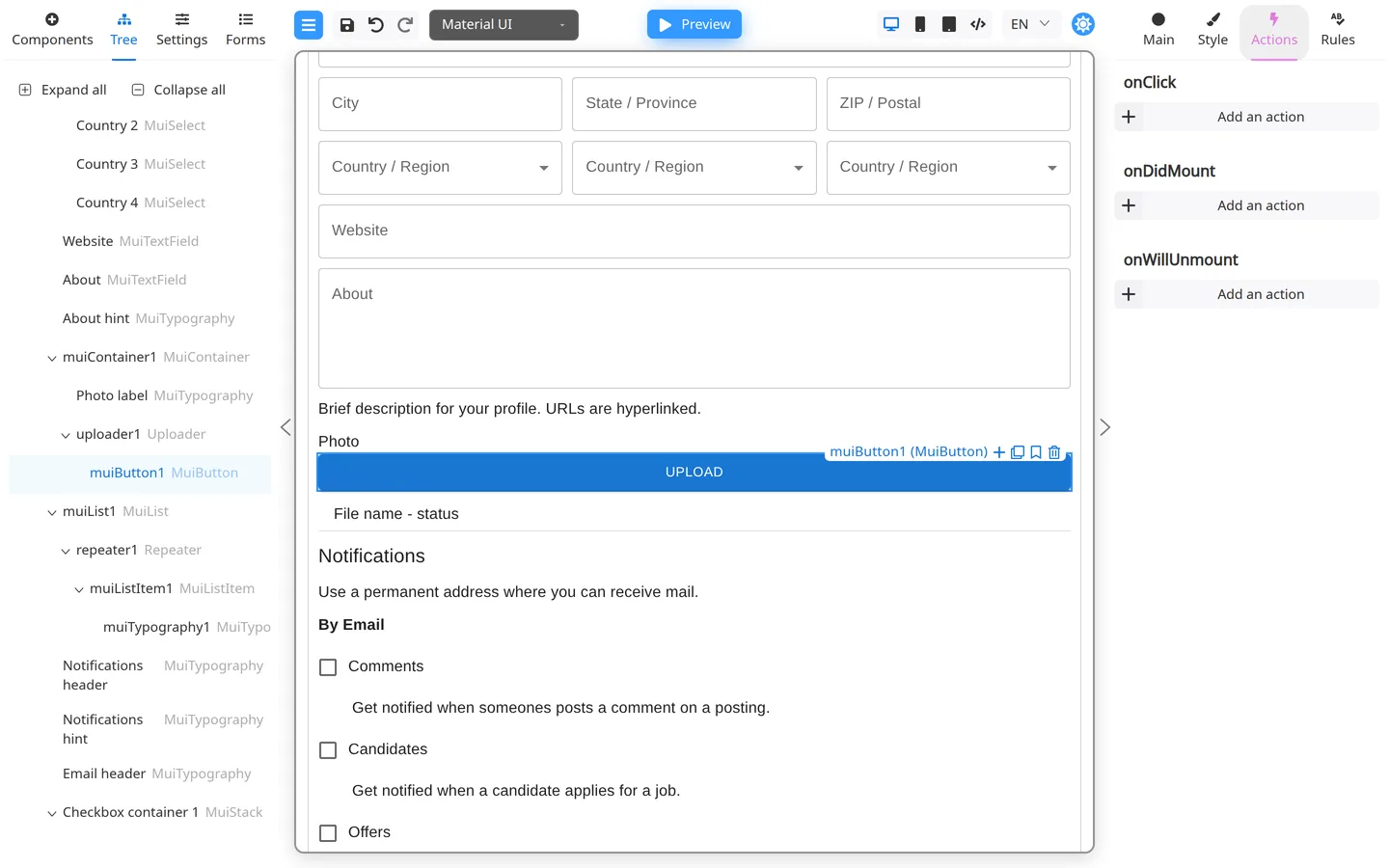
- Every button does the intended action in Preview.
- Success and error banners match your product tone.
Edge cases
- Long text in inputs does not break layout.
- Repeaters (if used) add and remove rows cleanly.
Handoff notes
Record:
- Form name and version
- Keys that need API data
- Any custom actions that need developer wiring
Summary
Run this checklist in Preview each time before handoff.