


Style tab basics
The Style tab on the right panel controls how a component looks: colors, typography, borders, and layout-related visual options.
Select a component
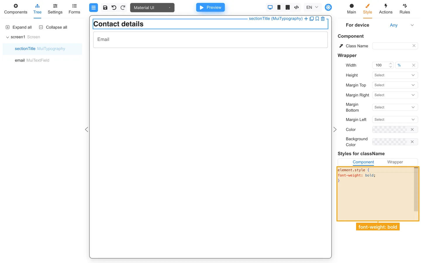
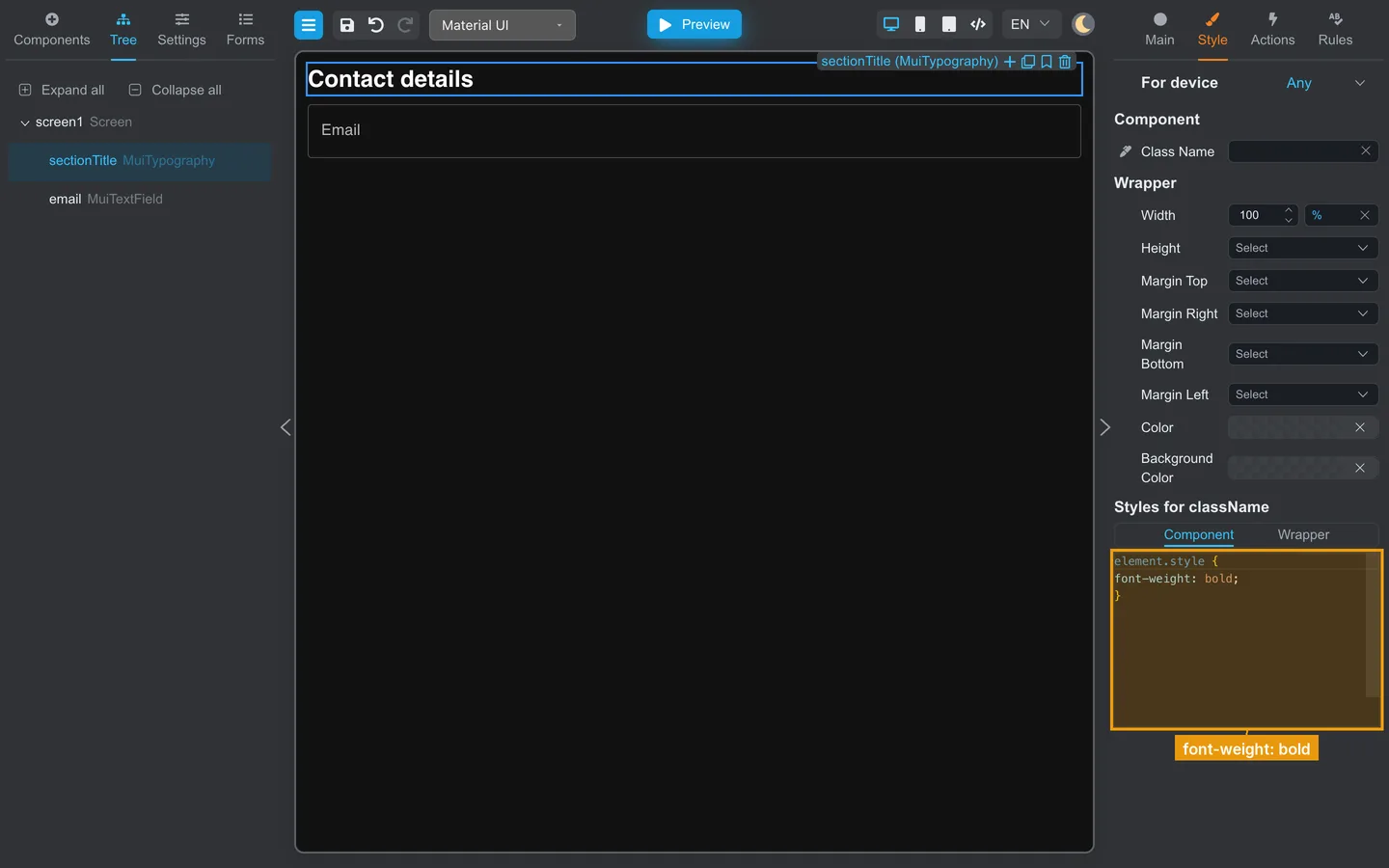
- Click the heading or field on the canvas, or select
sectionTitleoremailin Tree (labeled Contact details and Email on the canvas). - Click Style on the right.
- Enter CSS for the component (for example
font-weight: bold;on a heading). - Adjust other visual properties as needed (names depend on component type).
Common groups:
- Typography, font size, weight
- Colors, text, background, border
- Spacing, margin, padding on layout components
Preview
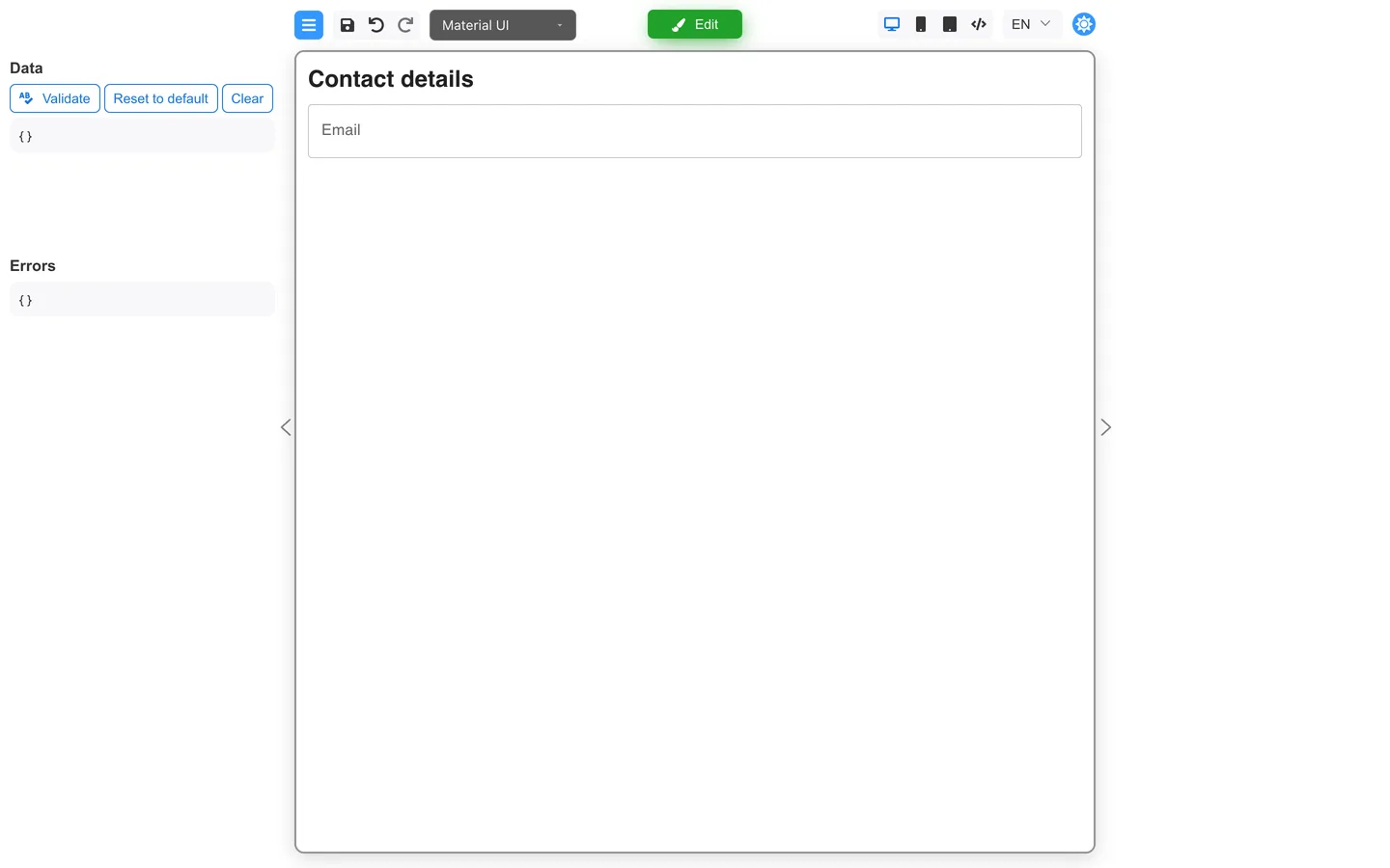
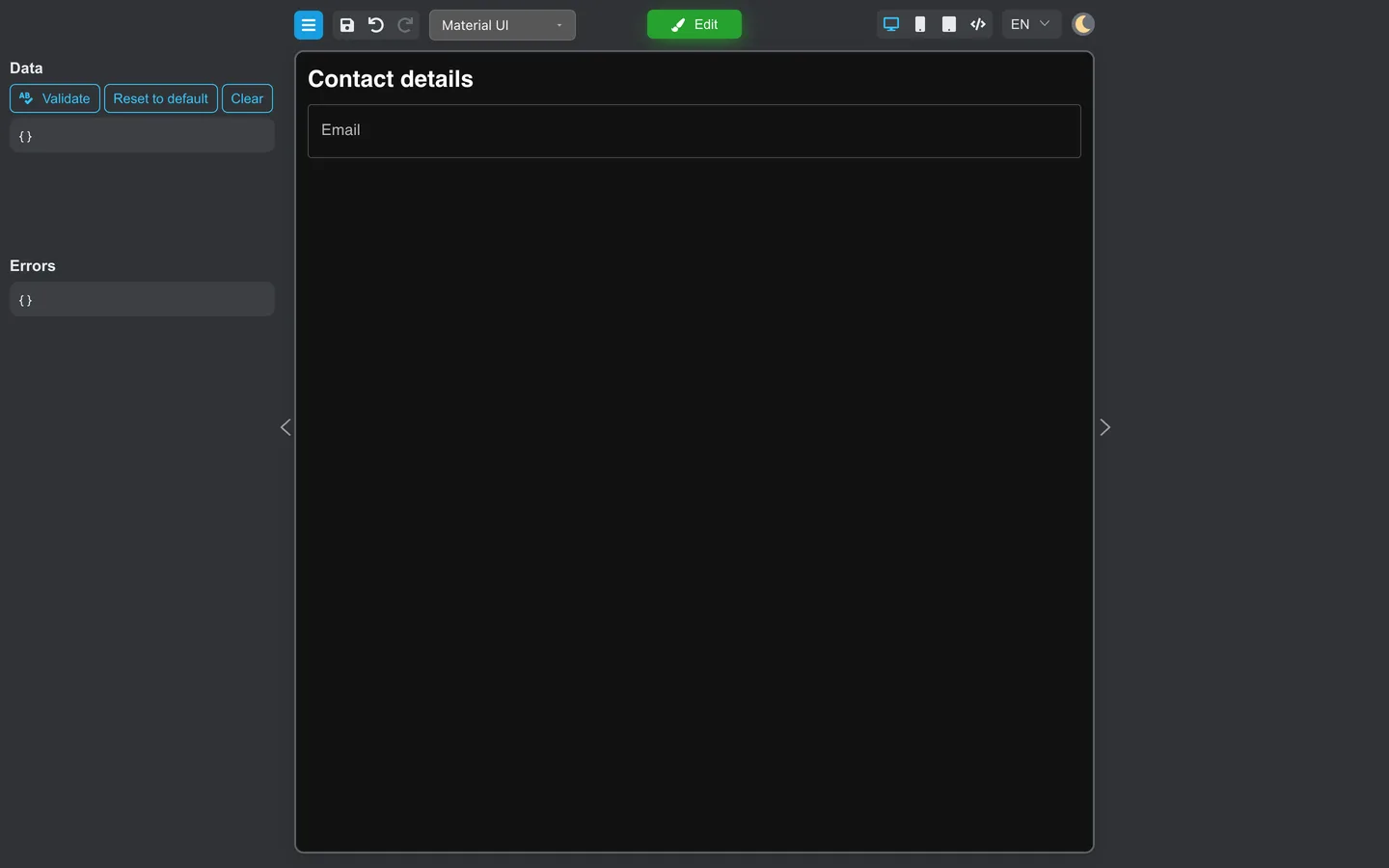
- Click Preview and confirm contrast and size on Mobile.
Developers: Programmatic styling and the Definer API are in Component styling.