


Use the right properties panel
The right panel shows settings for the selected component: label, required, spacing, behavior. If nothing is selected, you see Select element on form for edit properties.
Before you begin
- Open The Designer workspace for a map of the screen.
Select a component
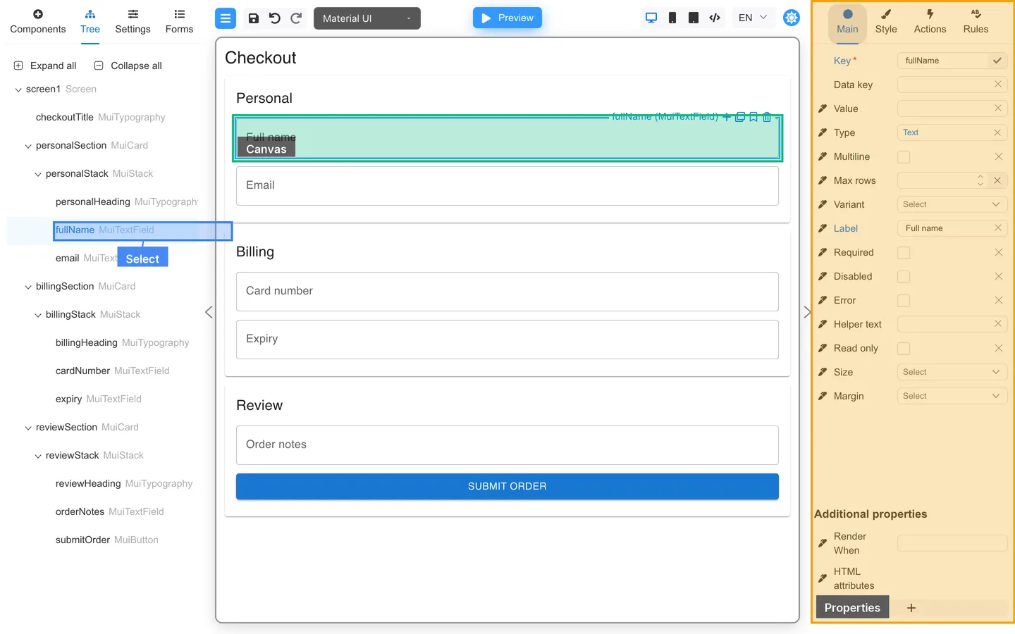
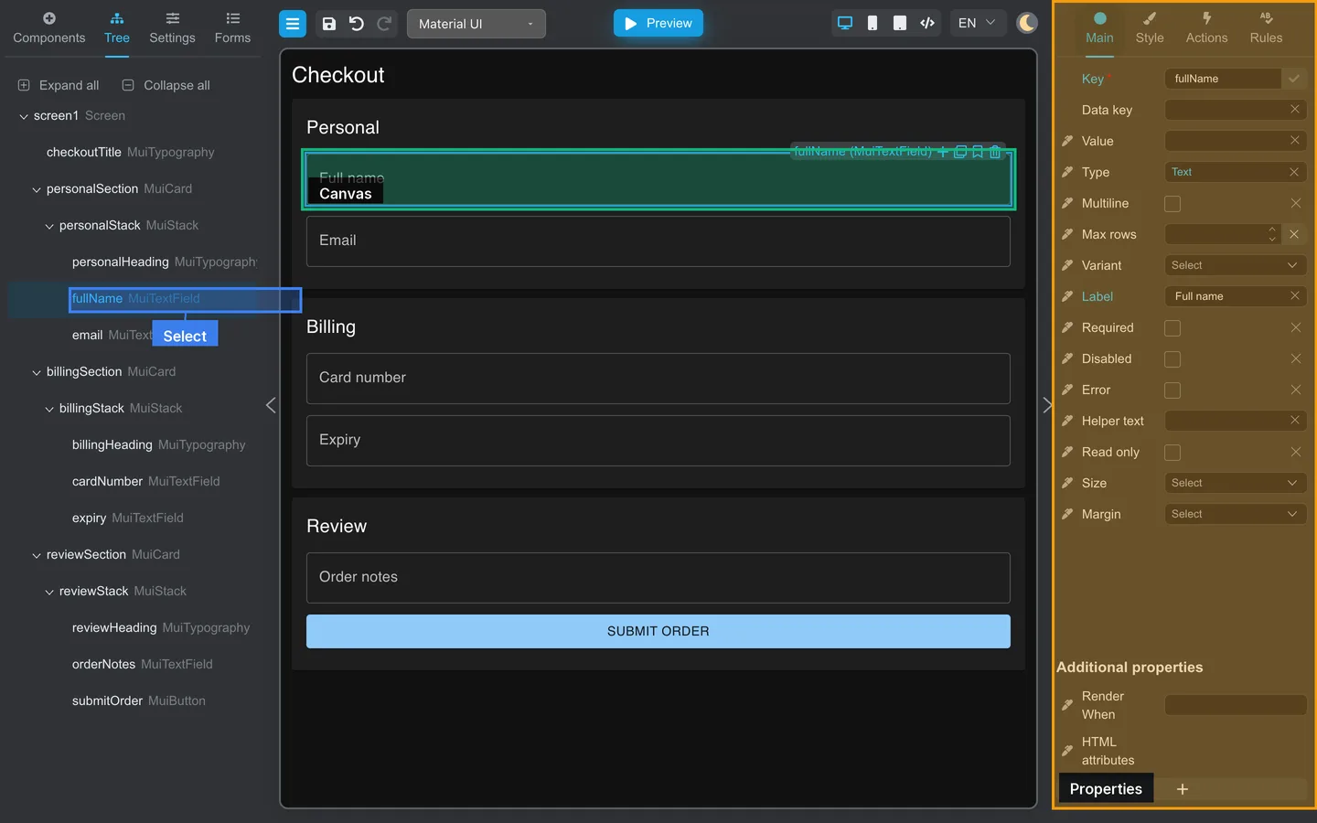
- Click a field or container on the canvas, or
- Click its row in the Tree tab.
The right panel populates when a component is selected. If nothing is selected, you see Select element on form for edit properties. Required fields may show a marker on Main.
| Setting | Tab |
|---|---|
| Label, placeholder, key, Render When | Main |
| Spacing and style | Style |
| What happens on events | Actions |
| Validation rules | Rules |
Main tab
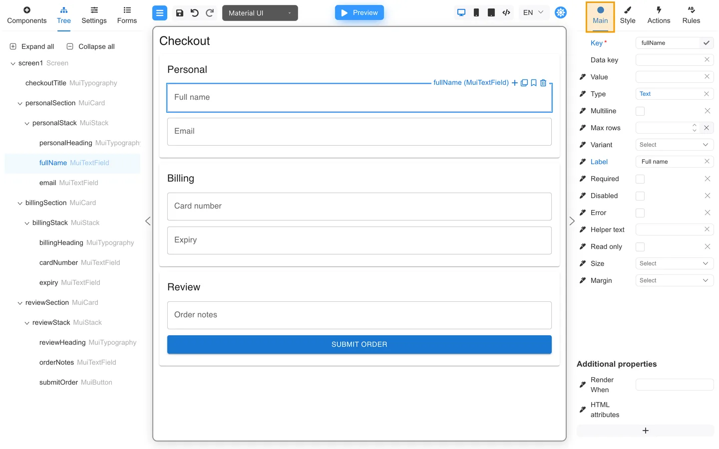
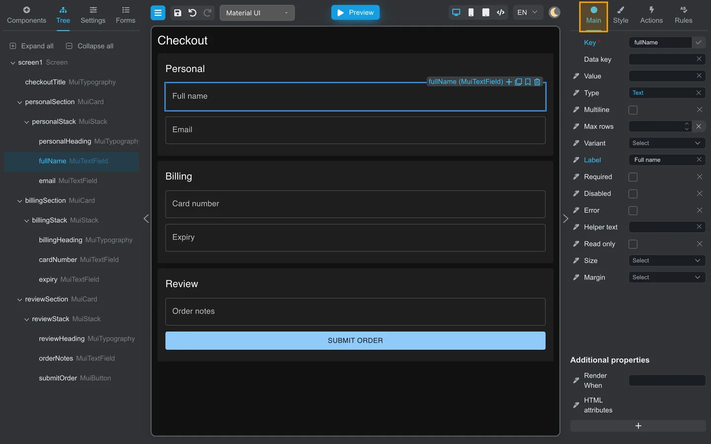
- Label, Key, placeholders, and core field options.
- Conditional visibility, including Render When, under Additional properties.
- Start here for everyday text and data settings.
Style tab
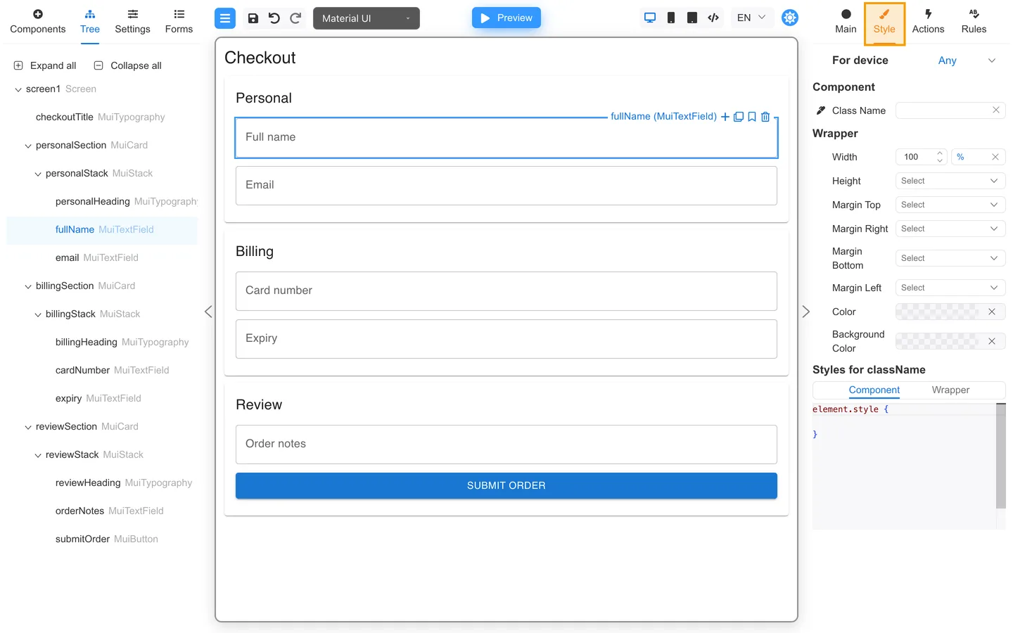
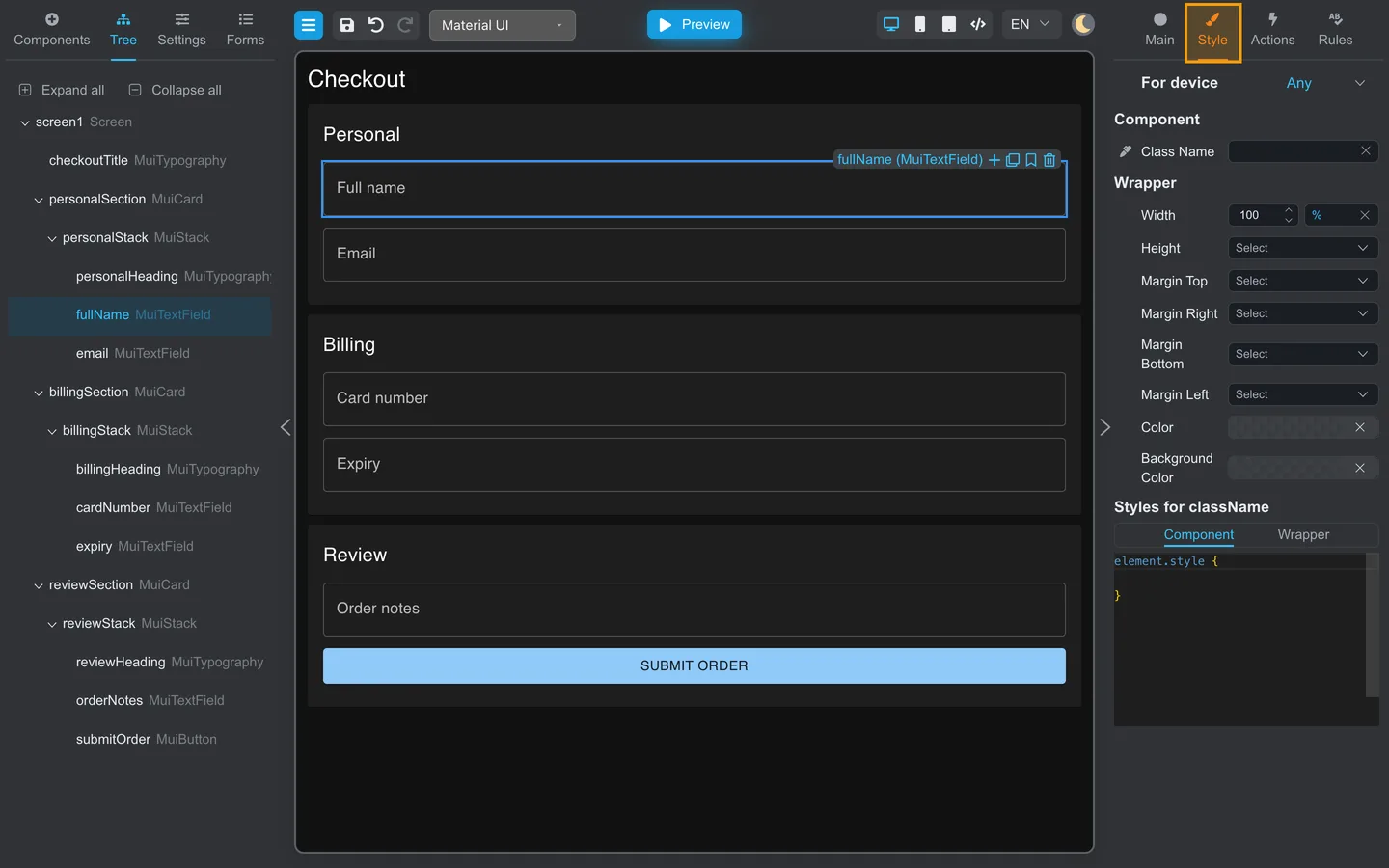
- Spacing, typography, and visual options supported by your component library.
- Use when authors need appearance changes without developer help.
Actions tab
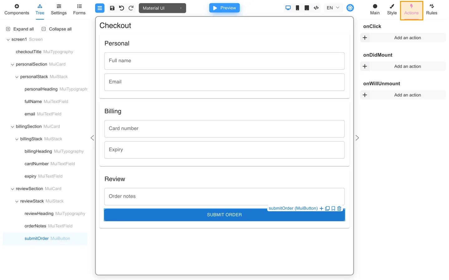
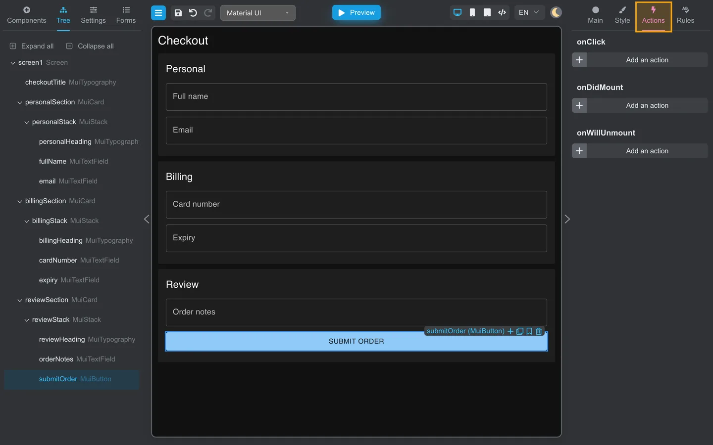
- Event handlers such as button clicks.
- See Button actions on your first form for a first example.
Rules tab
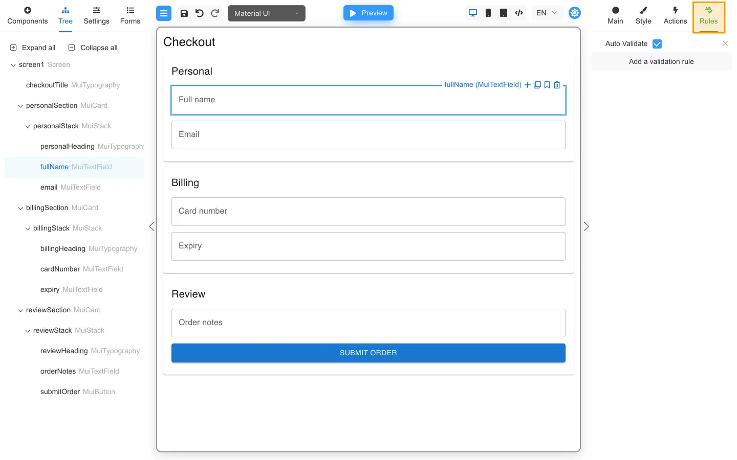
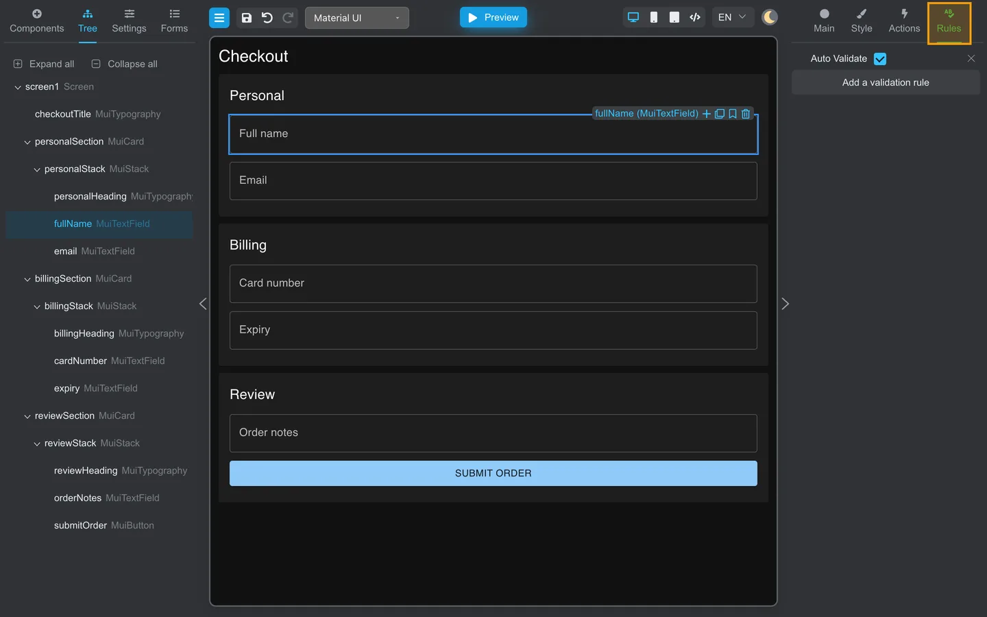
- Validation rules and messages for the selected field.
- See Validation on your first form.
Form-wide settings are not here
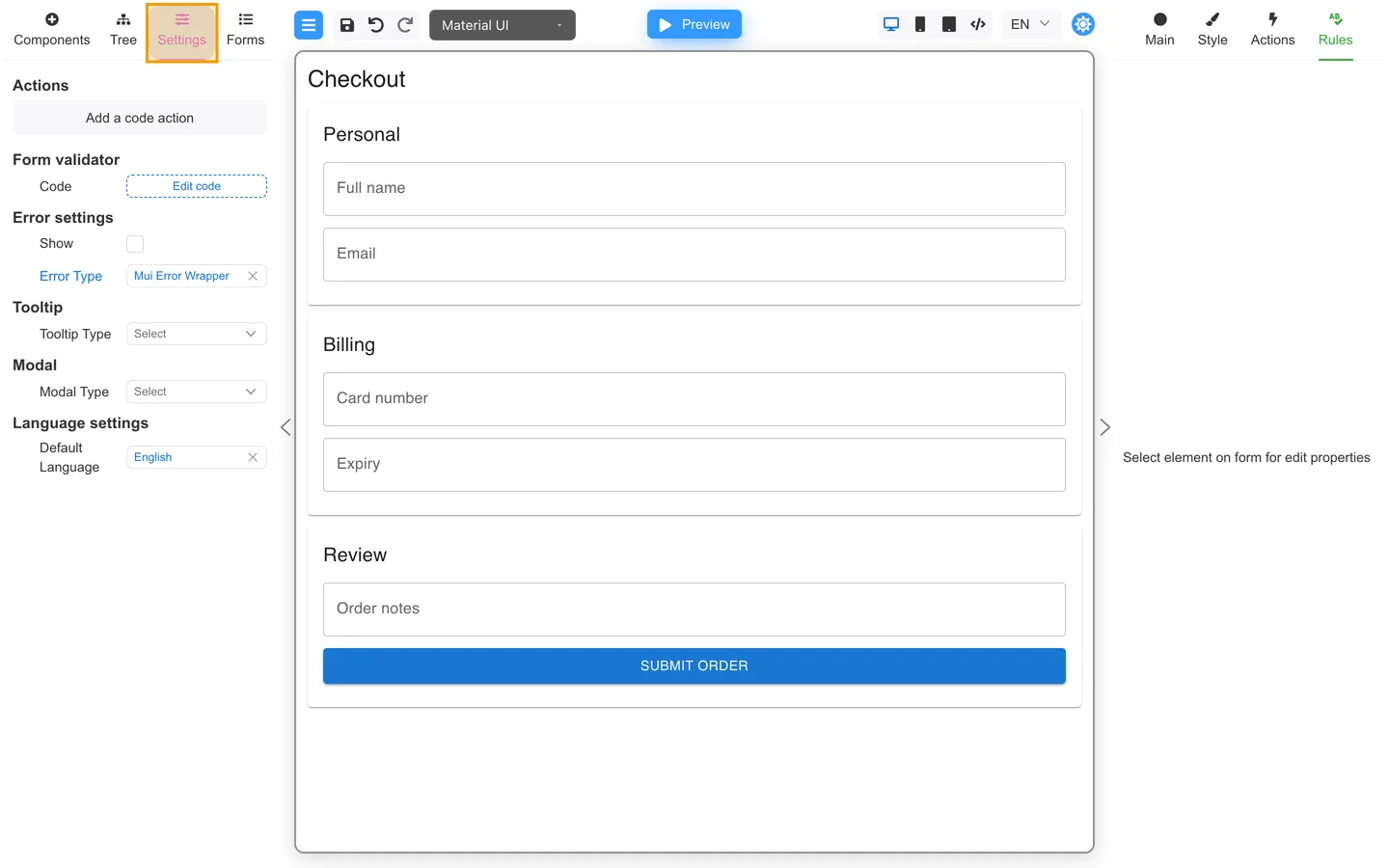
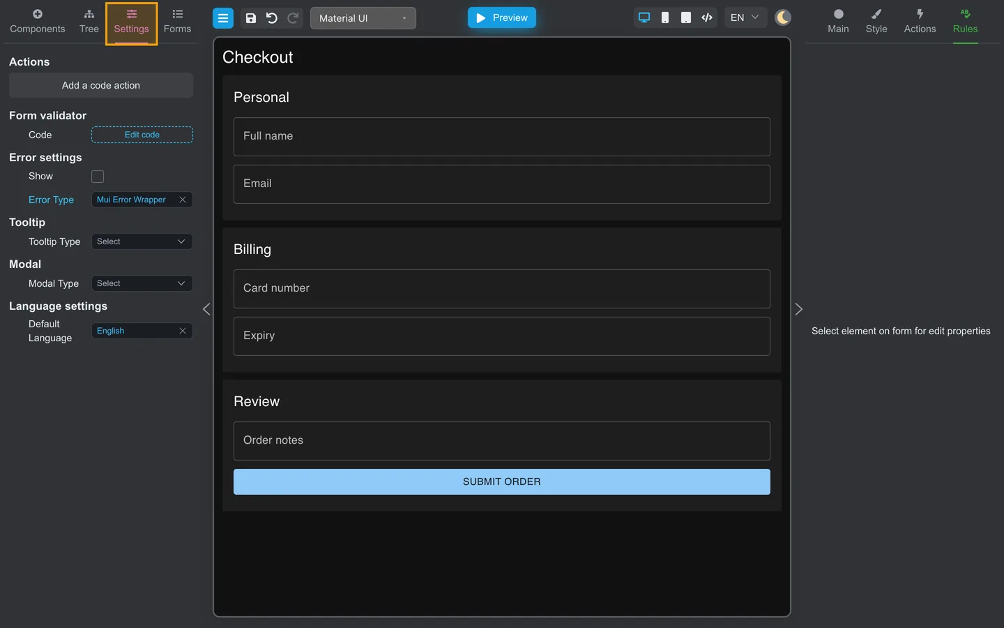
Open Settings on the left for form-wide error display, Form validator, tooltip defaults, languages, and similar options that apply to the whole form.
Summary
The right panel edits the selected component only. Main and Rules are the tabs authors use most. Left Settings covers the entire form.