


Form-wide errors and tooltips
Some display options apply to the entire form, not one field. You set them on the Settings tab under Error settings and Tooltip.
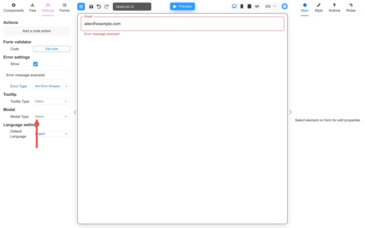
Error settings
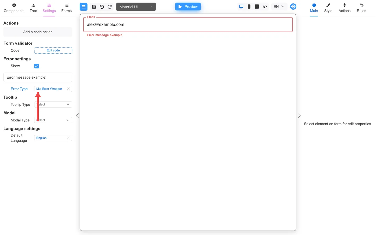
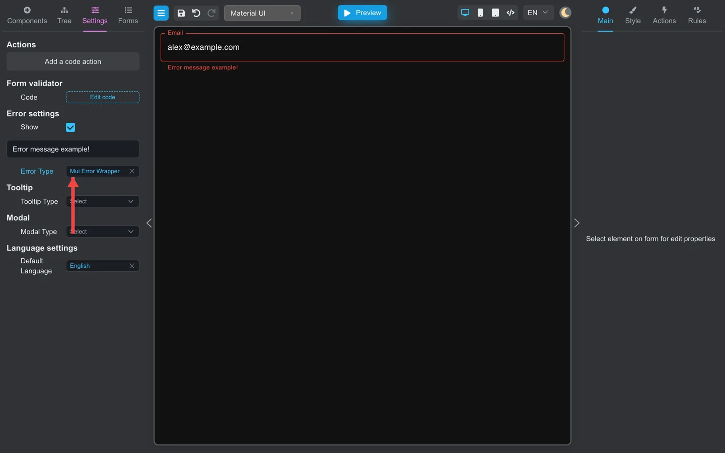
- Open Settings → Error settings.
- Choose the error component and adjust the properties shown for it.
- Turn on Show to display a sample error temporarily while you review those settings.
Show is a Designer preview aid. It is not saved as an “always show errors” setting for the live form.
Test in Preview with Validate after you change the type.
Tooltip settings
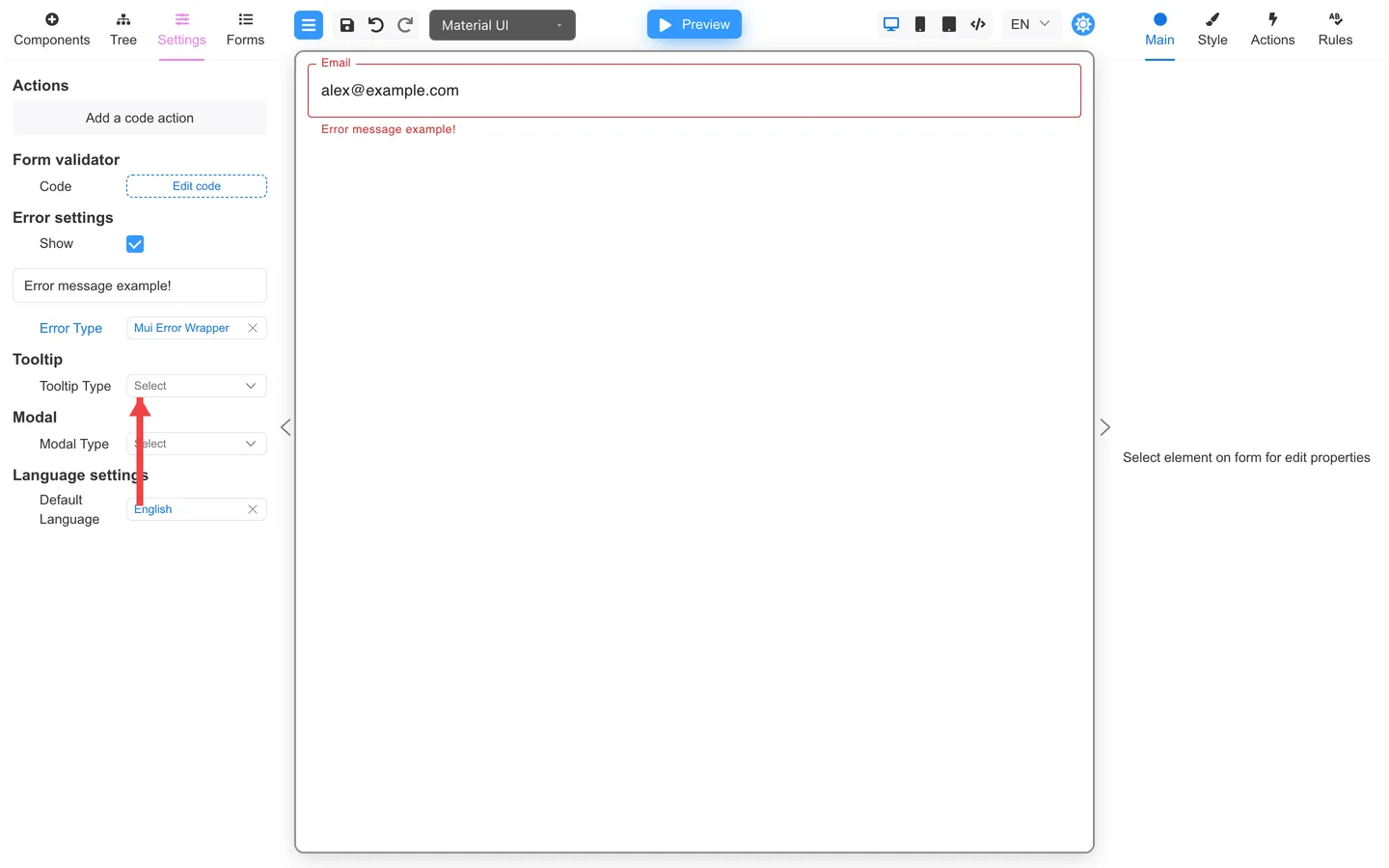
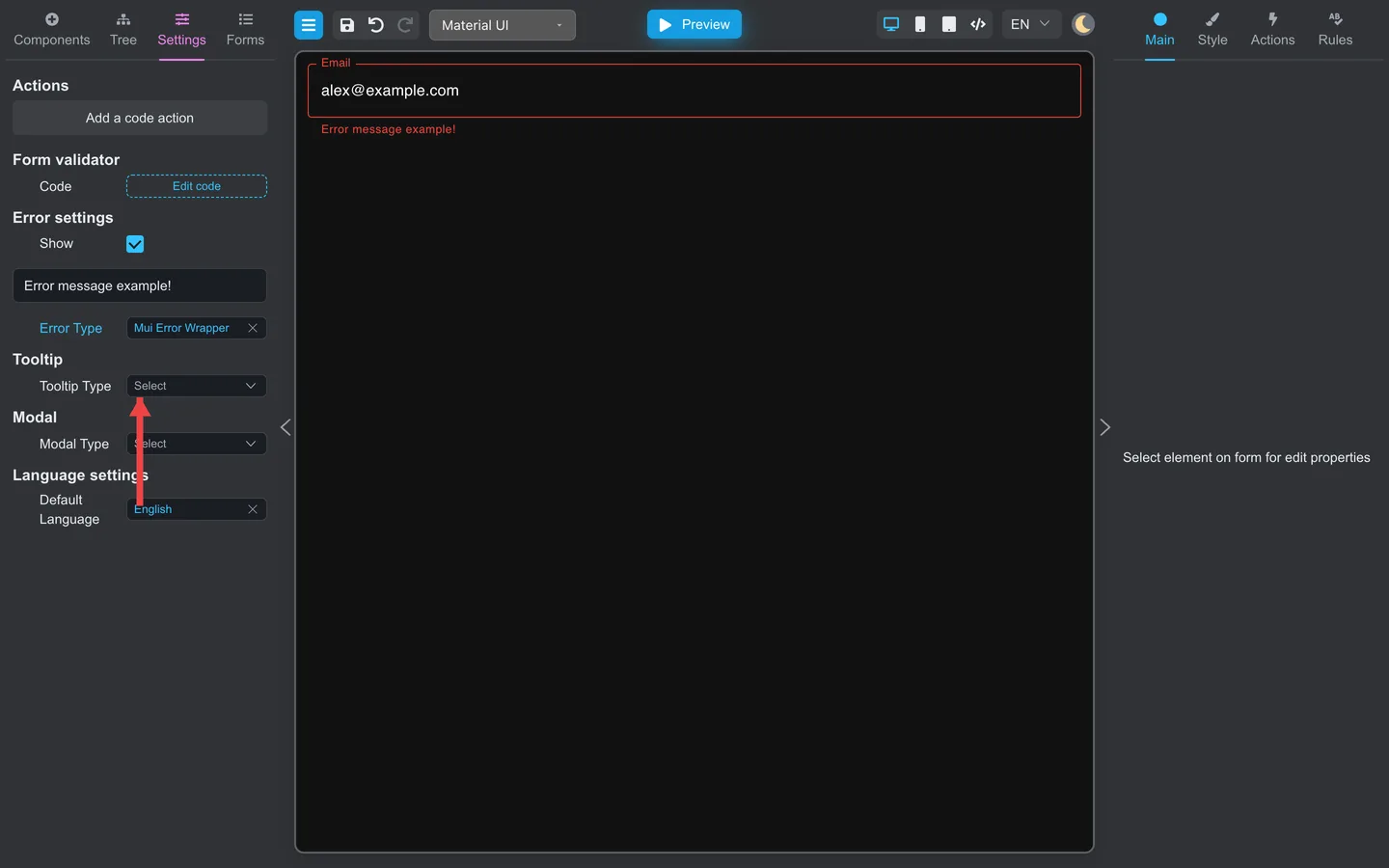
- Open Settings → Tooltip.
- Set the default tooltip style for components that support tooltips.
- On individual fields, enable Tooltip on Main when you need extra help on one control.
Helper text on Main is usually better for always-visible hints. Tooltips show on hover or focus.
Modal settings
Summary
Use Settings for form-wide defaults for errors, tooltips, and modals. Field messages still come from Rules and Main.