


Validation basics
Validation checks whether user input meets the form’s rules. Most day-to-day work happens on the Rules tab for each field.
Required fields
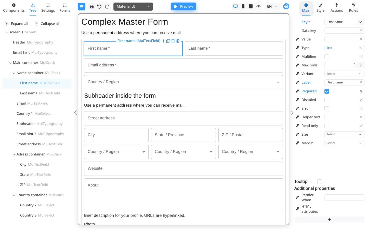
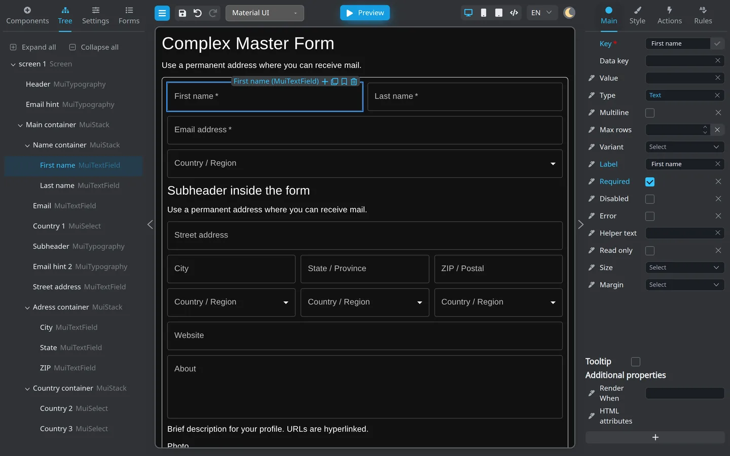
The Required checkbox on Main and the Required entry on Rules edit the same validation rule. Configuring either one is enough; you do not need both.
Use Required on Main as a quick toggle, or open Rules to review the rule and its message. Non empty is a separate validation rule with its own settings; add it only when you specifically need that rule. Other rules include Email, Min, and Max.
Rule picker
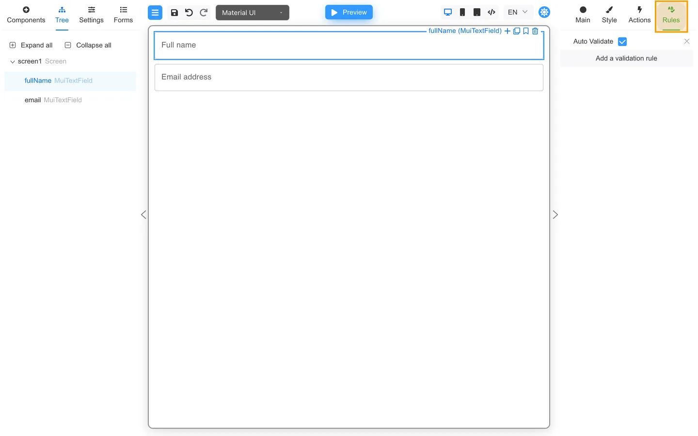
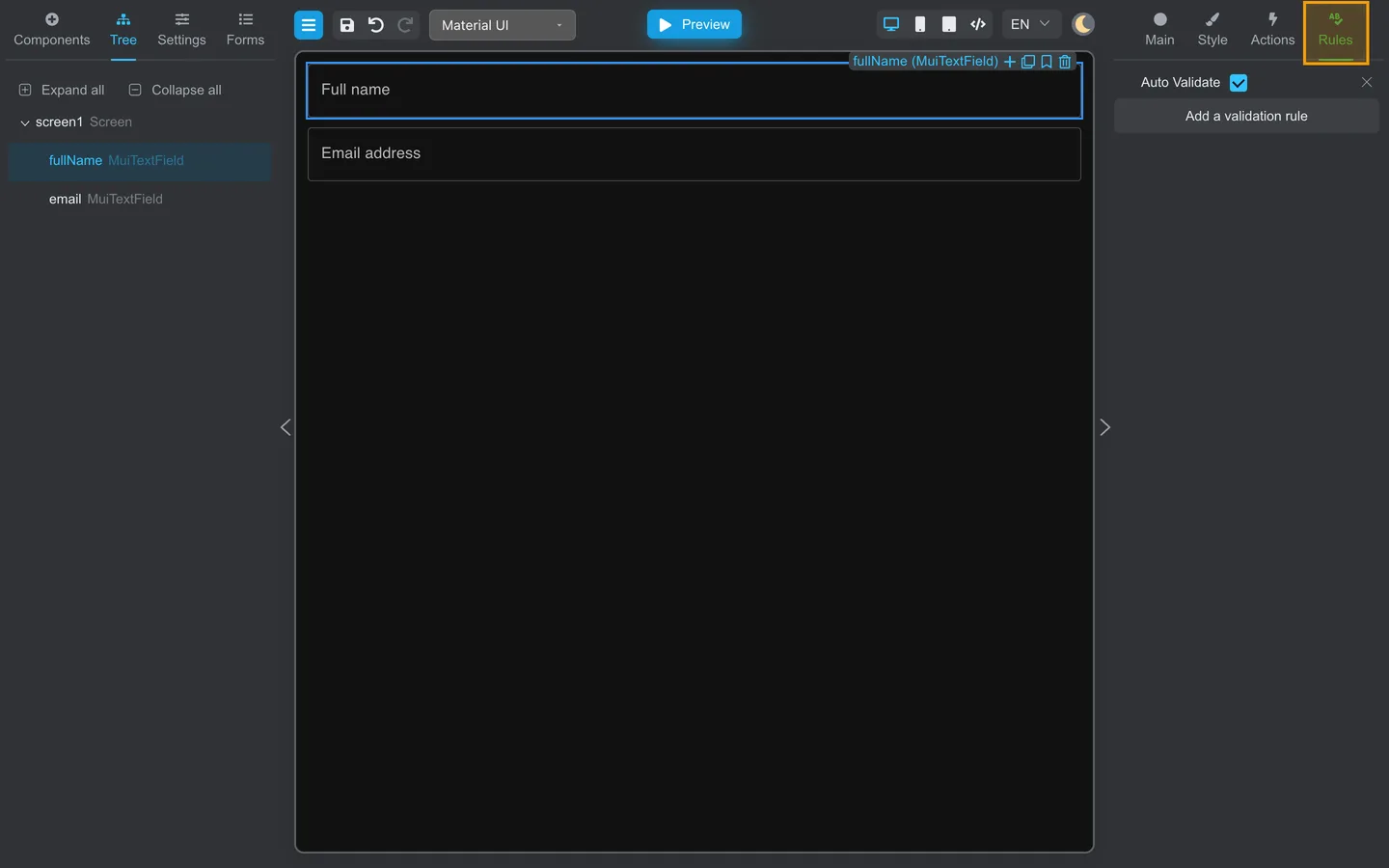
When you click Add a validation rule, you may see:
- Non empty, Length, Min, Max
- Regex, Email, Url
- Code (a validator for supported string fields, written in Designer and usually developer-reviewed)
Each rule can include a Message users see when validation fails.
Code here means a field validation rule, not an action. Code actions and app-provided Custom actions are configured separately on a component’s Actions tab.
Auto Validate
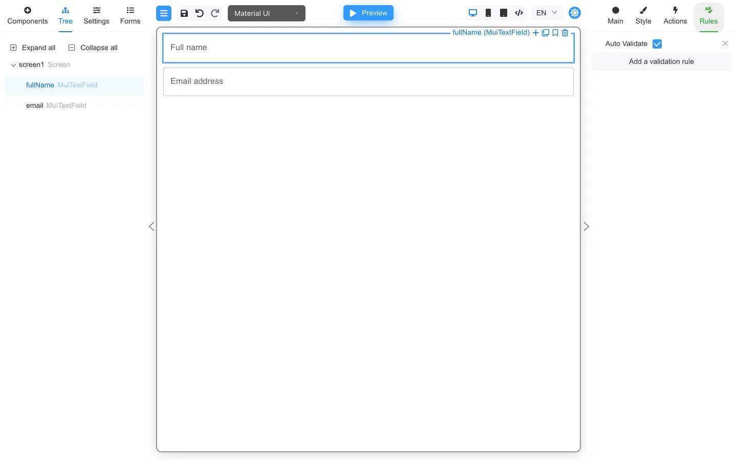
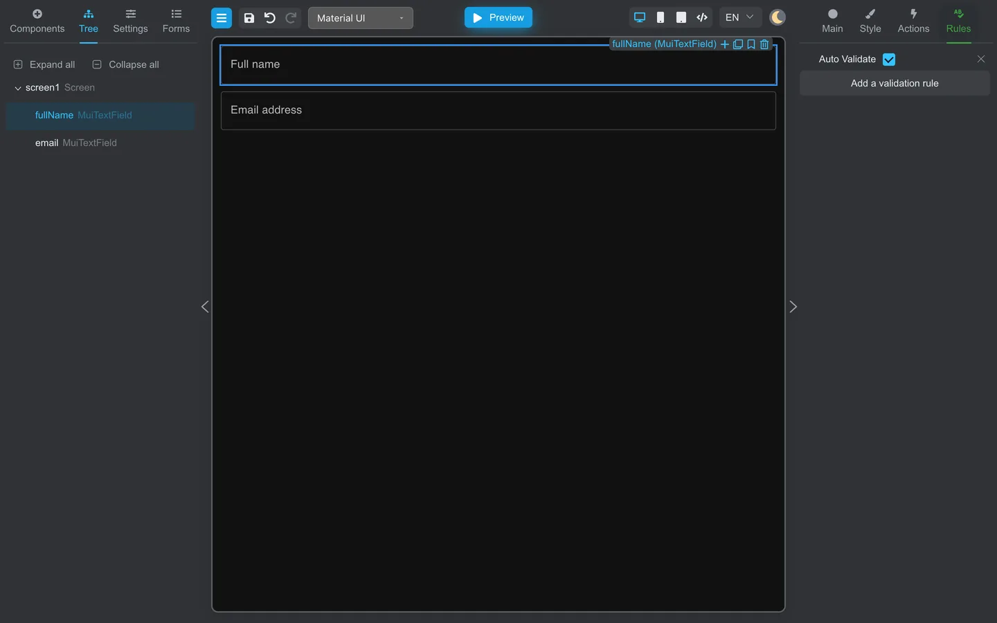
Auto Validate on Rules runs checks as users interact with the field. When off, validation may run on submit or when you click Validate in Preview.
Test validation
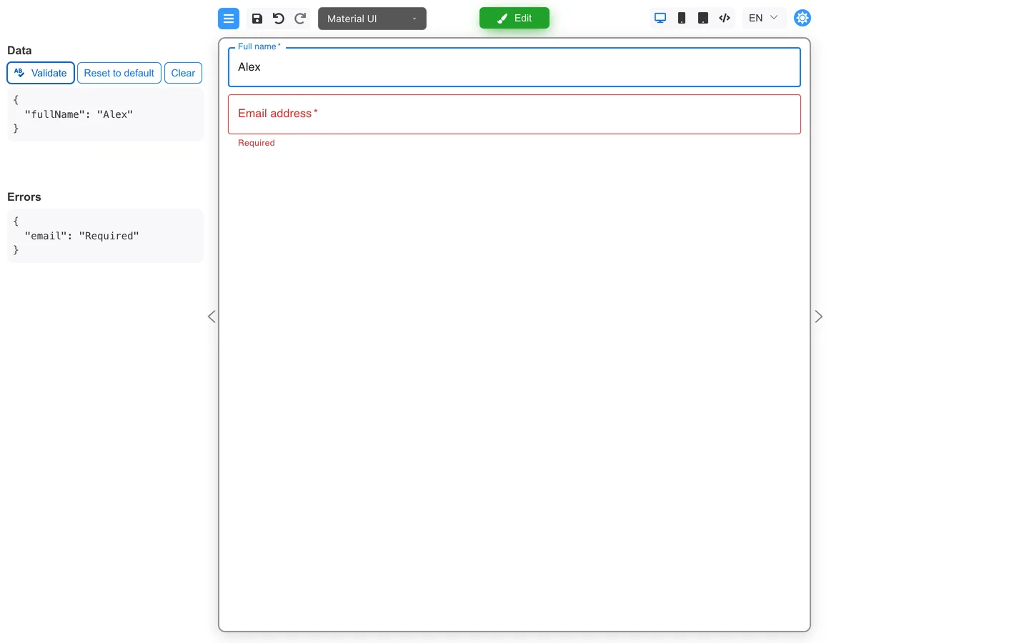
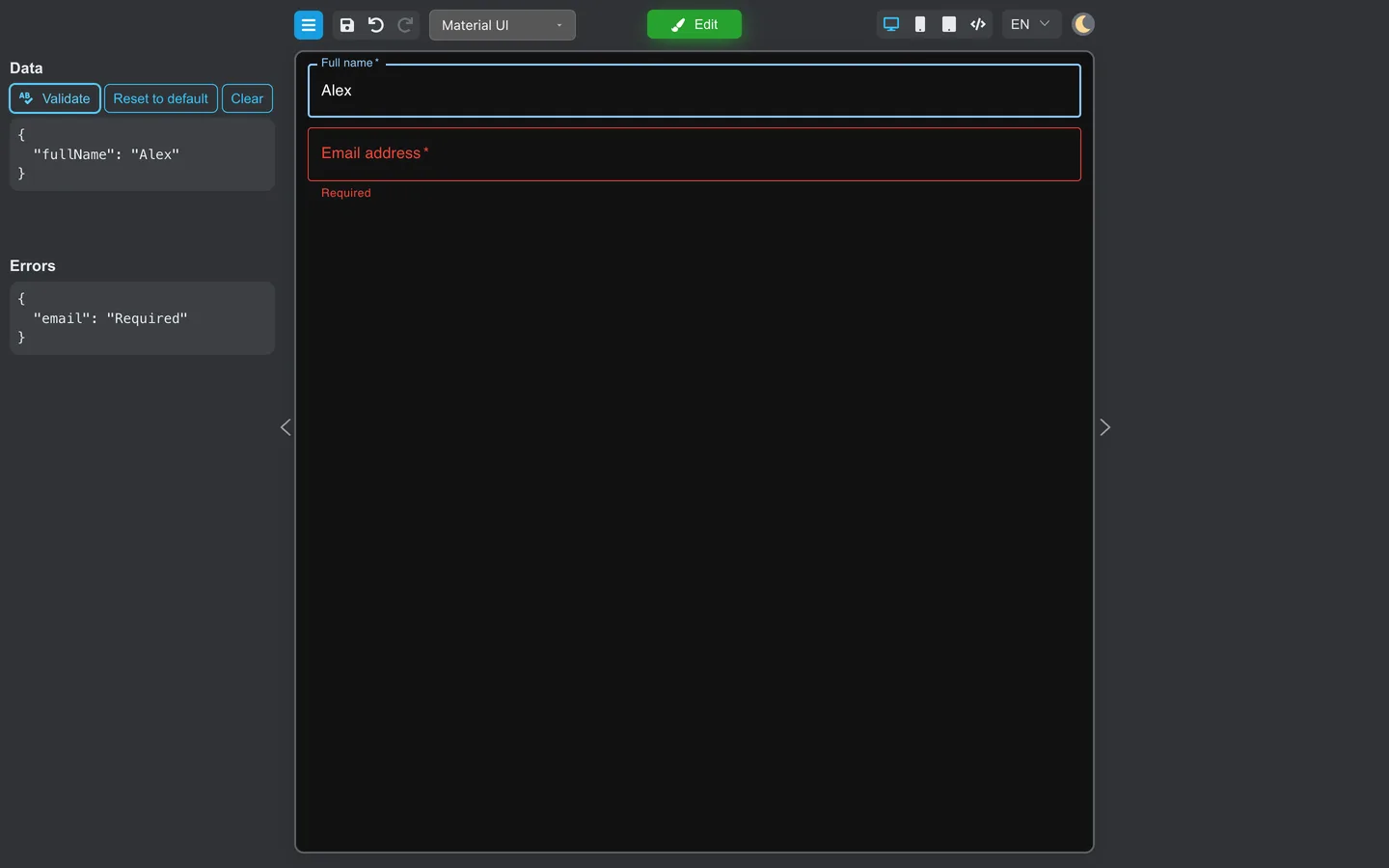
- Preview the form.
- Trigger errors (empty required fields, invalid email).
- Fix messages on Rules until they are clear for end users.
Summary
Per-field rules live on Rules. Required on Main is a shortcut to the same rule. Pick built-in types before a Code validator, and verify messages in Preview.