


Light and dark theme
Designer supports light and dark themes (and may follow system theme). Toggle theme to see whether your form remains readable.
Toggle theme
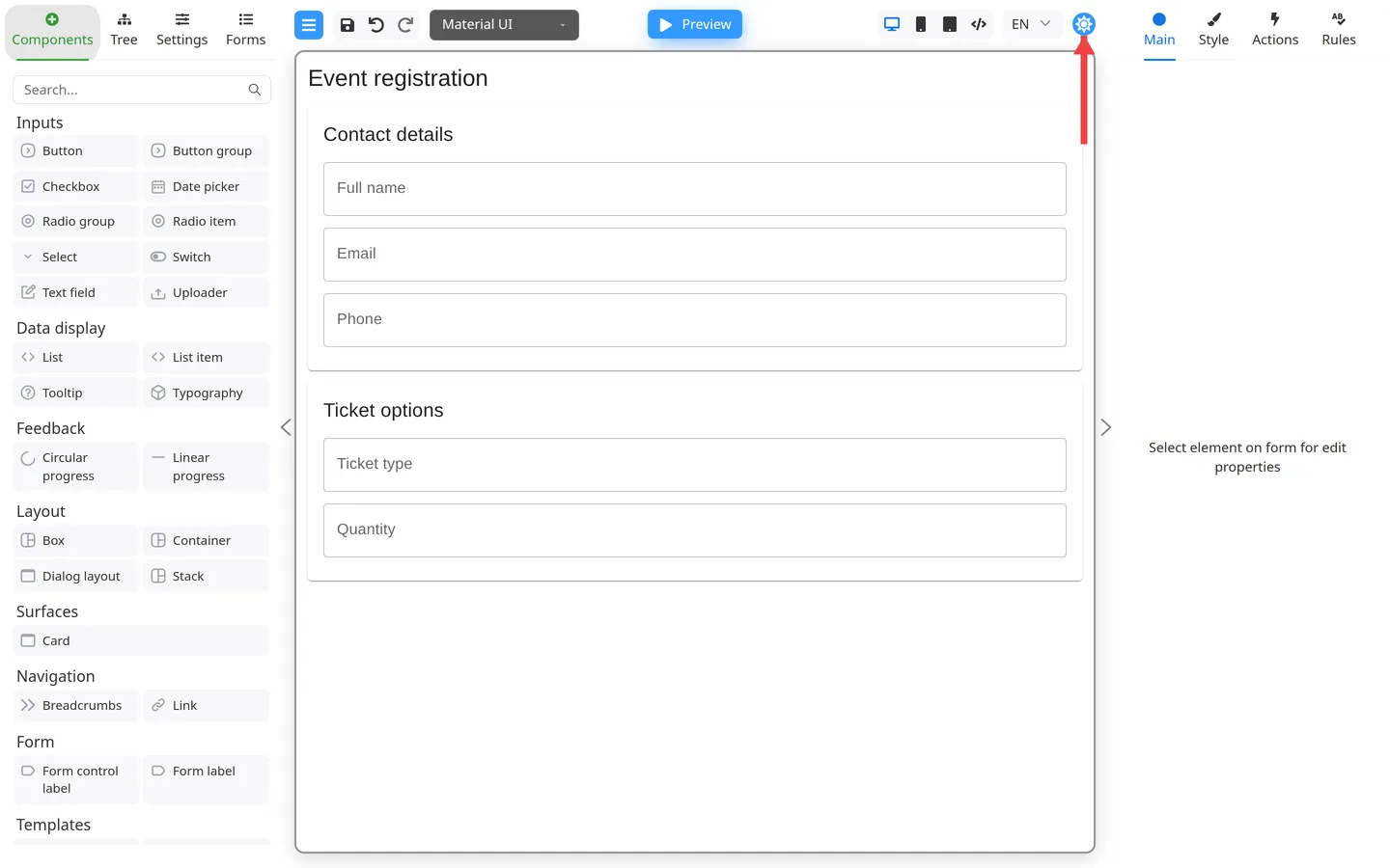
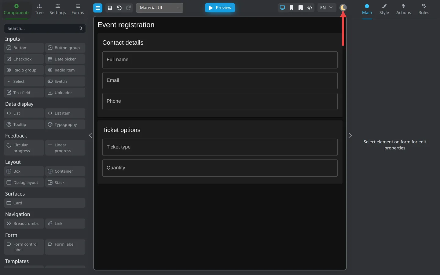
- Find the theme toggle in the header (sun/moon icon, tooltip Toggle theme).
- Switch themes and review the canvas and Preview.
What theme affects
- Designer panels, menus, and theme colors
- May affect default field appearance on the canvas depending on component library
End-user theme in production is controlled by your host application, not only this toggle.
Author checklist
- Labels readable in both themes
- Error states visible on fields
- Buttons have enough contrast
Developers: Theme APIs for embedded apps: FAQ: theme manipulation.
Summary
Use header theme toggle to sanity-check contrast. Production theming is configured in your app.