


Choice fields
Choice inputs let users pick from options you define or load from data.
Pick a component
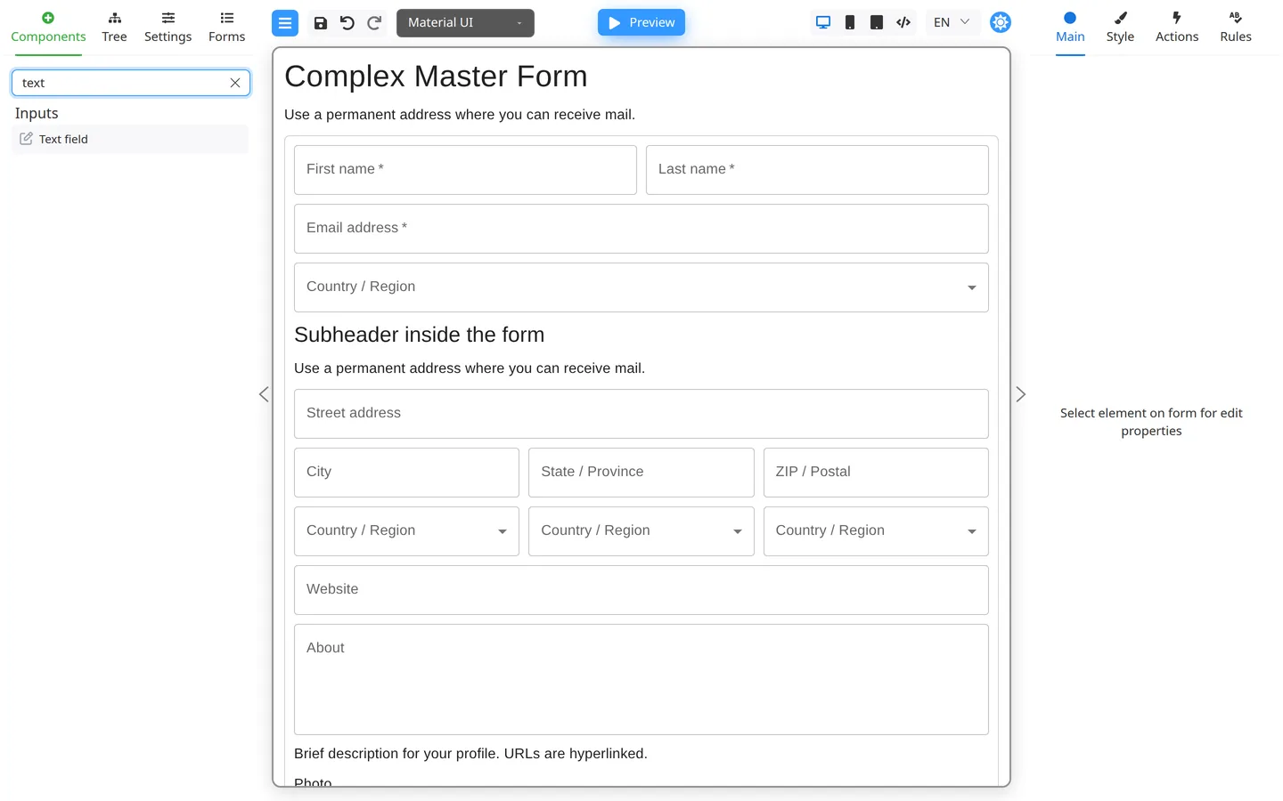
| Need | Typical component |
|---|---|
| One choice from many | Select / dropdown |
| One choice from a few | Radio group |
| Several visible choices | Checkbox group |
| Several choices in a compact list | MultiSelect / TagPicker |
| Yes/no | Checkbox / Switch |
The available components depend on how your Designer is set up. Mantine provides MultiSelect and Checkbox group, while React Suite provides TagPicker. The current Material UI set does not include a ready-made field for selecting several options.
Add static options
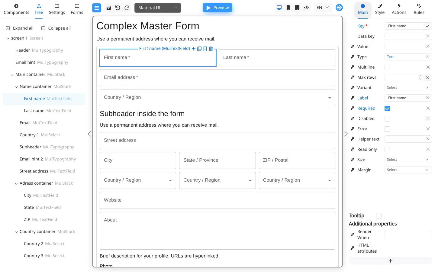
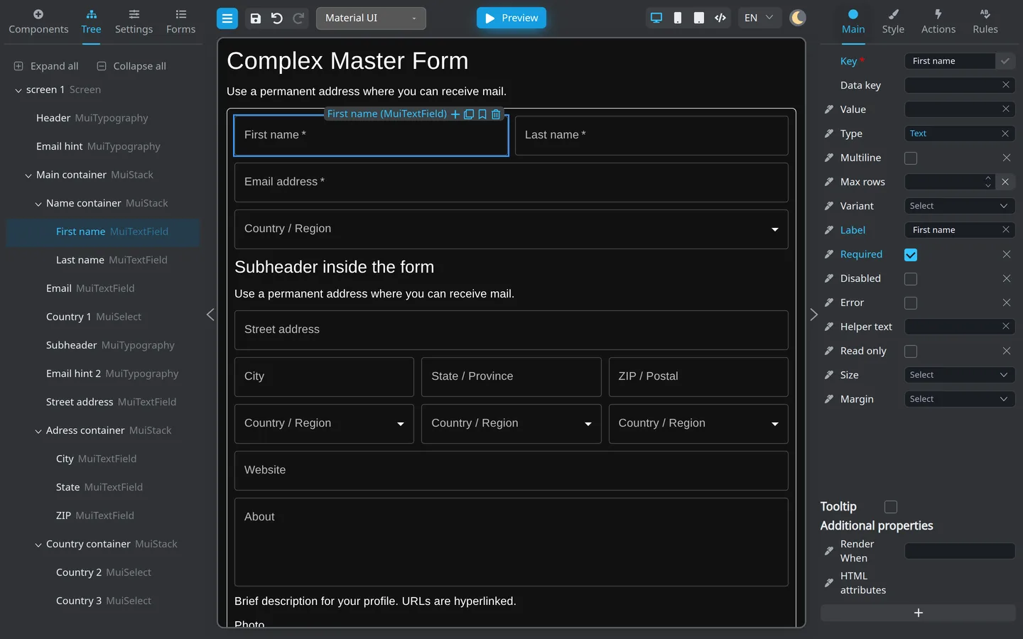
- Drag a component for a list of options from Components, such as Select, Radio group, MultiSelect, Checkbox group, or TagPicker.
- Select it → Main.
- Add options (label and value columns depend on component).
- Preview and try selecting one or several options, as applicable.
Dynamic options
When options come from an API, see Load options from external data.
Summary
Match the component type to the number of choices. Configure static options on Main; dynamic lists need developer wiring.