


Preview on mobile and tablet
The header includes view mode buttons so you can see how the form fits Desktop, Mobile, or Tablet widths. On mobile and tablet, an Orientation control toggles portrait and landscape.
Device modes provide an approximate layout preview, not a complete emulation of a specific browser or device. Test the finished form on a real phone or tablet before handoff.
Choose a device mode
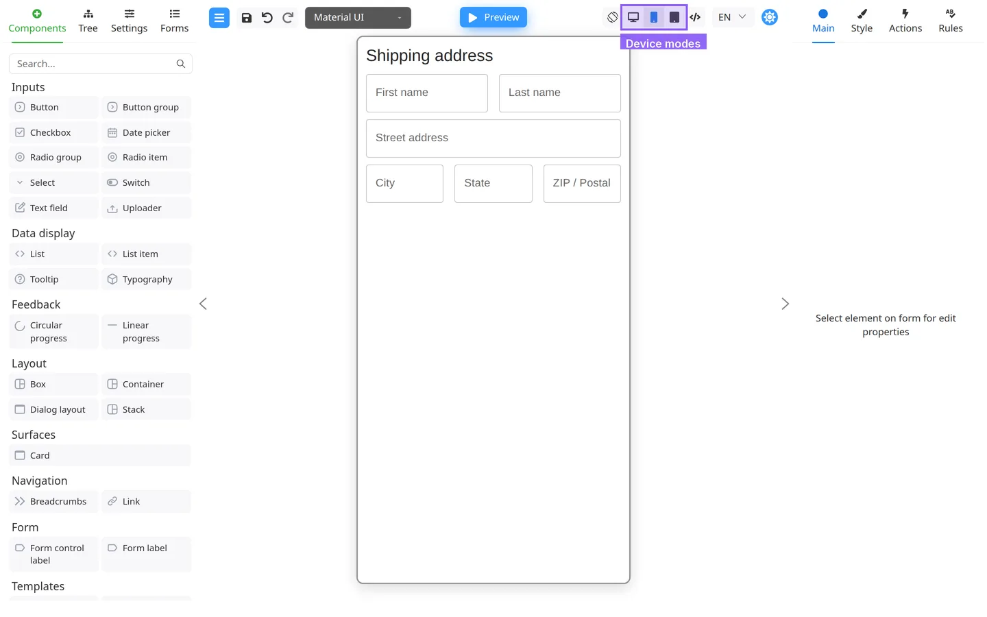
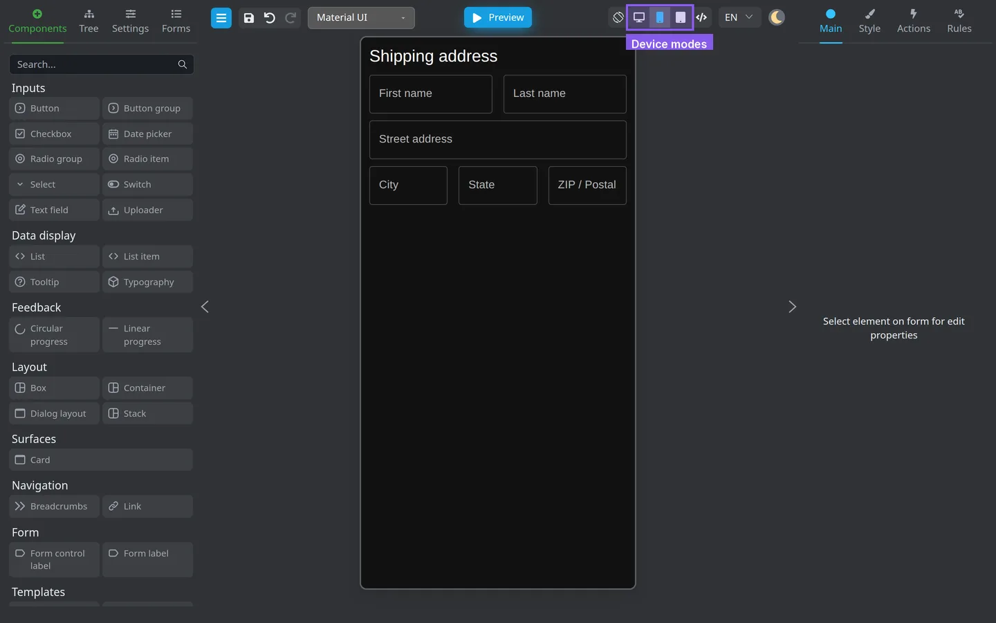
- In the center header, find the device buttons (tooltips: Desktop, Mobile, Tablet).
- Click Mobile or Tablet.
- The canvas width changes to match that profile.
You can switch modes in Edit or Preview.
Toggle orientation (mobile / tablet only)
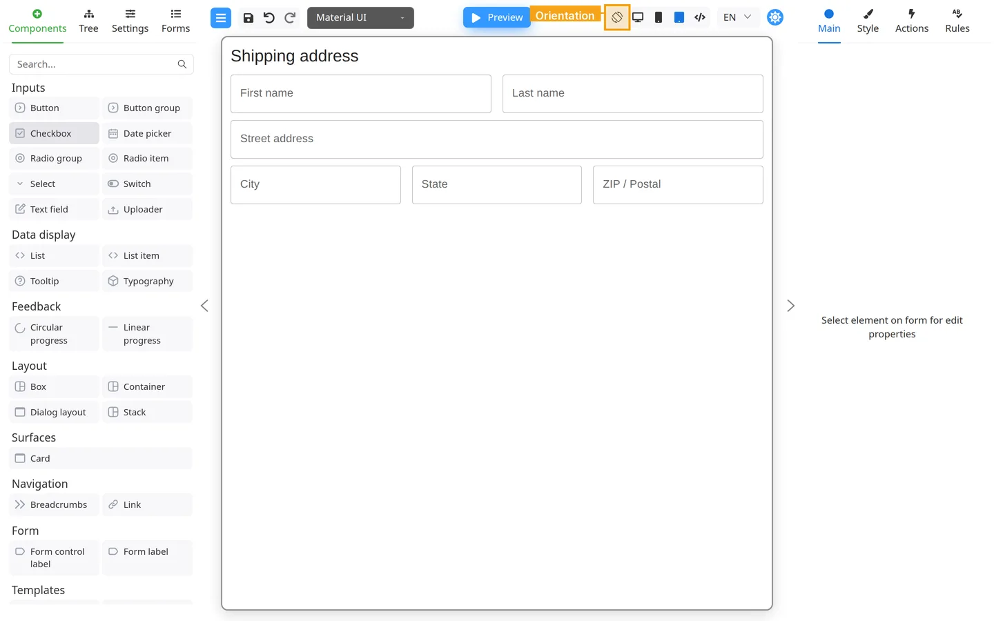
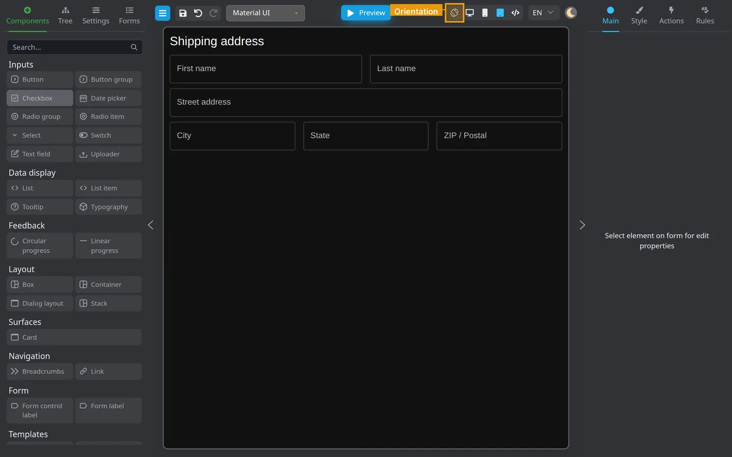
- With Mobile or Tablet active, click Orientation (rotate icon).
- Compare portrait and landscape layouts.
- Confirm labels, buttons, and multi-column stacks do not overlap or clip.
Test interactions
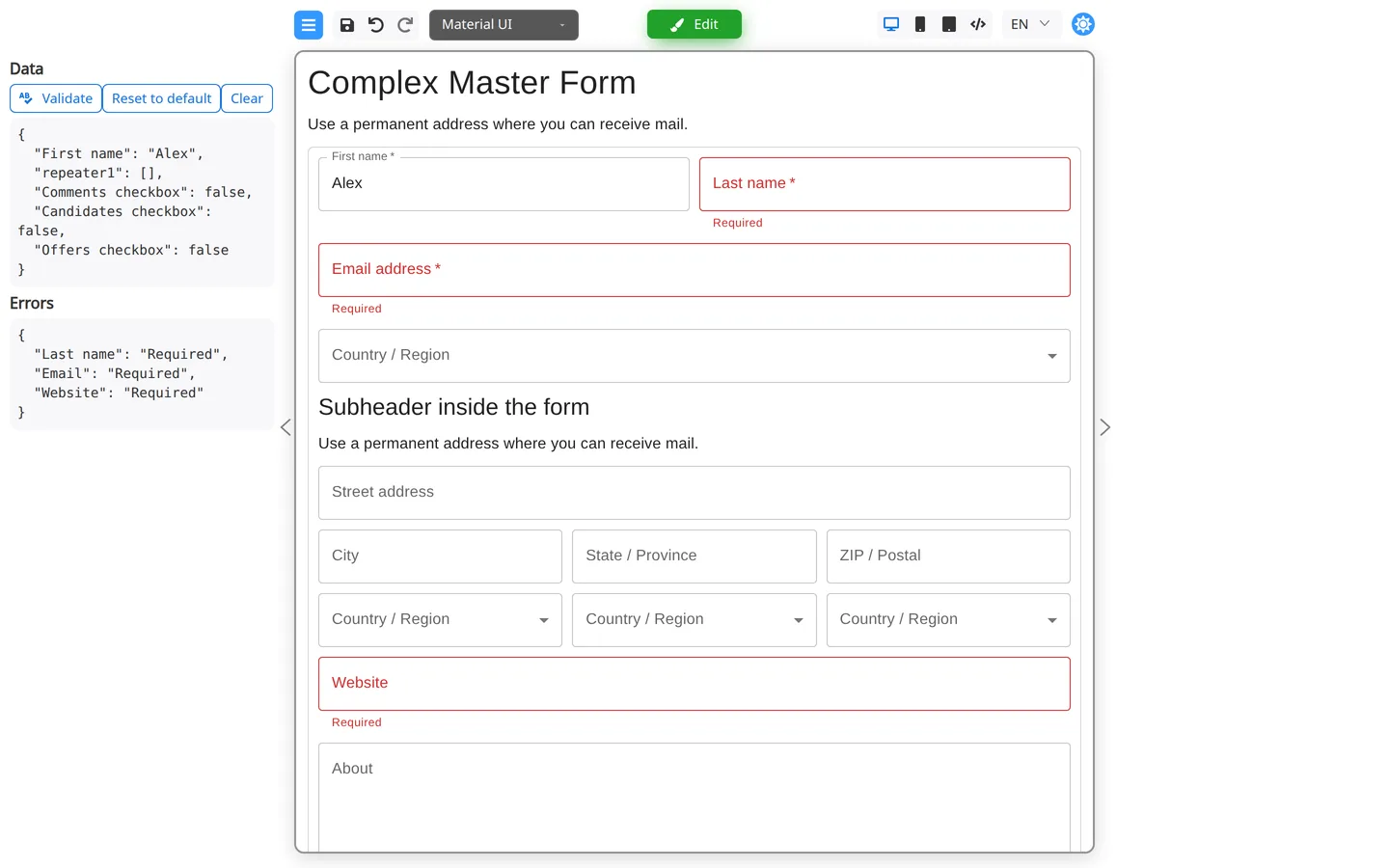
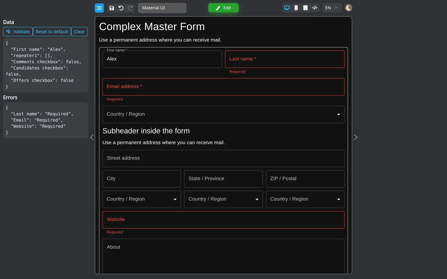
- Click Preview.
- At the narrow width, click through each field, picker, and submit button.
- Repeat on a real phone or tablet: tap controls, scroll the page, open the on-screen keyboard, and submit the form.
- Note any field that is hard to tap or read.
Check the result
- Active device button is highlighted.
- Form content reflows inside the simulated width.
Summary
Use Desktop / Mobile / Tablet in the header for an approximate width check. Orientation applies on mobile and tablet only. Run Preview mode tools and test on a real device representative of the devices your users have.