


Add components from the palette
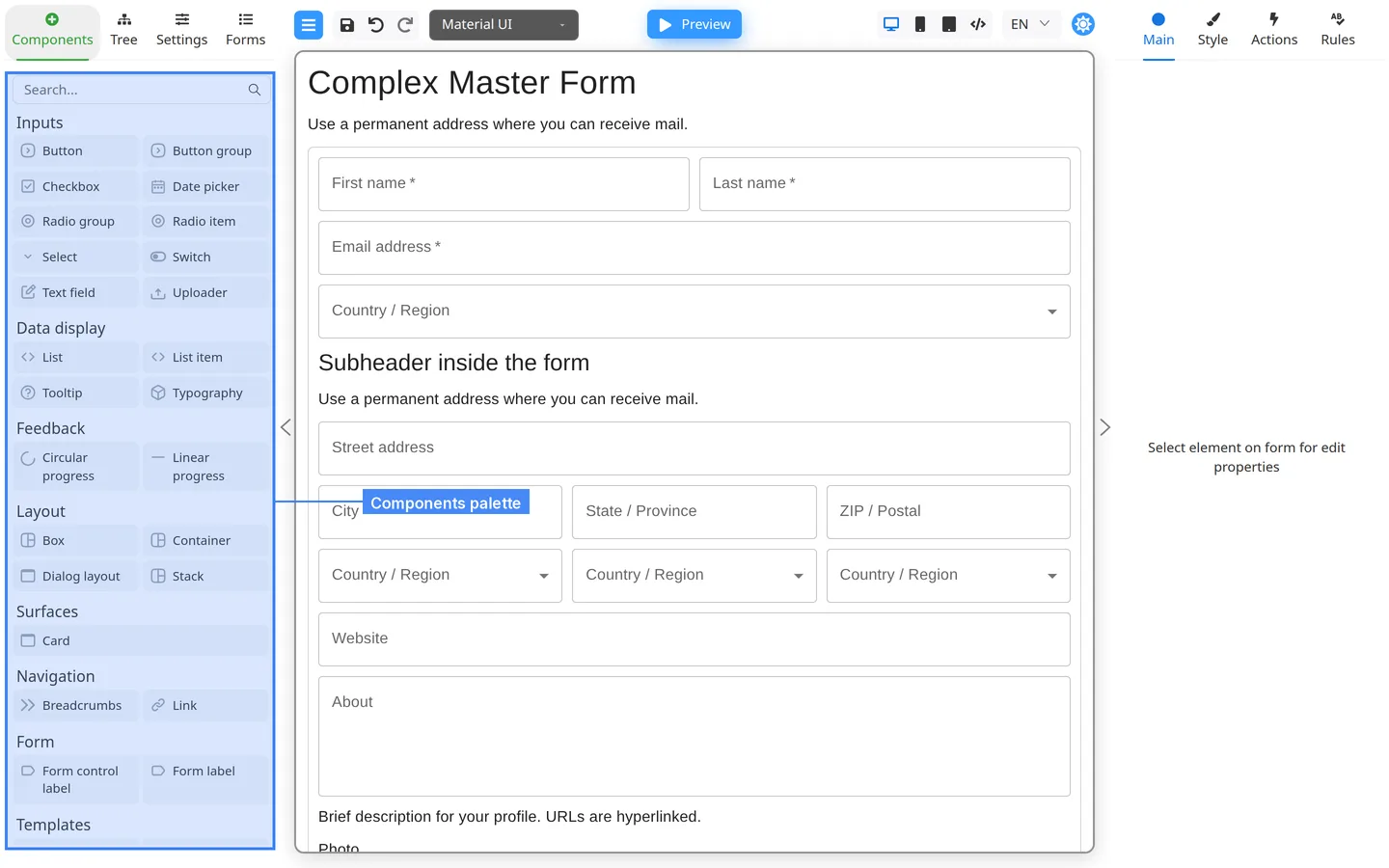
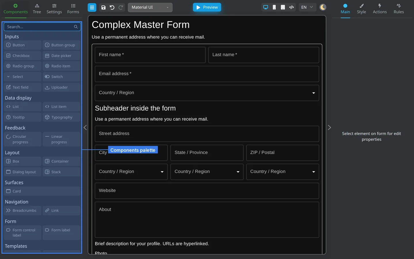
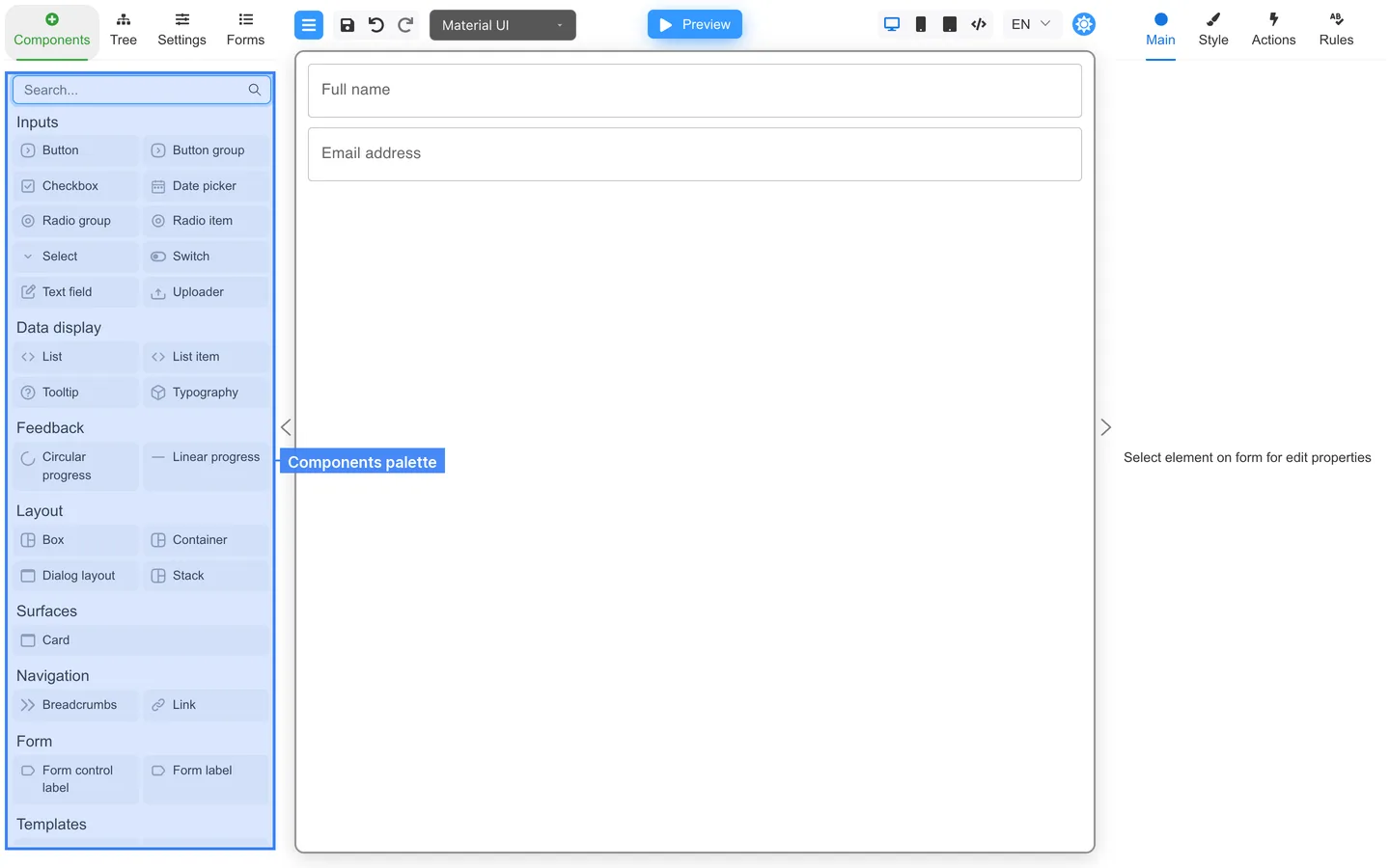
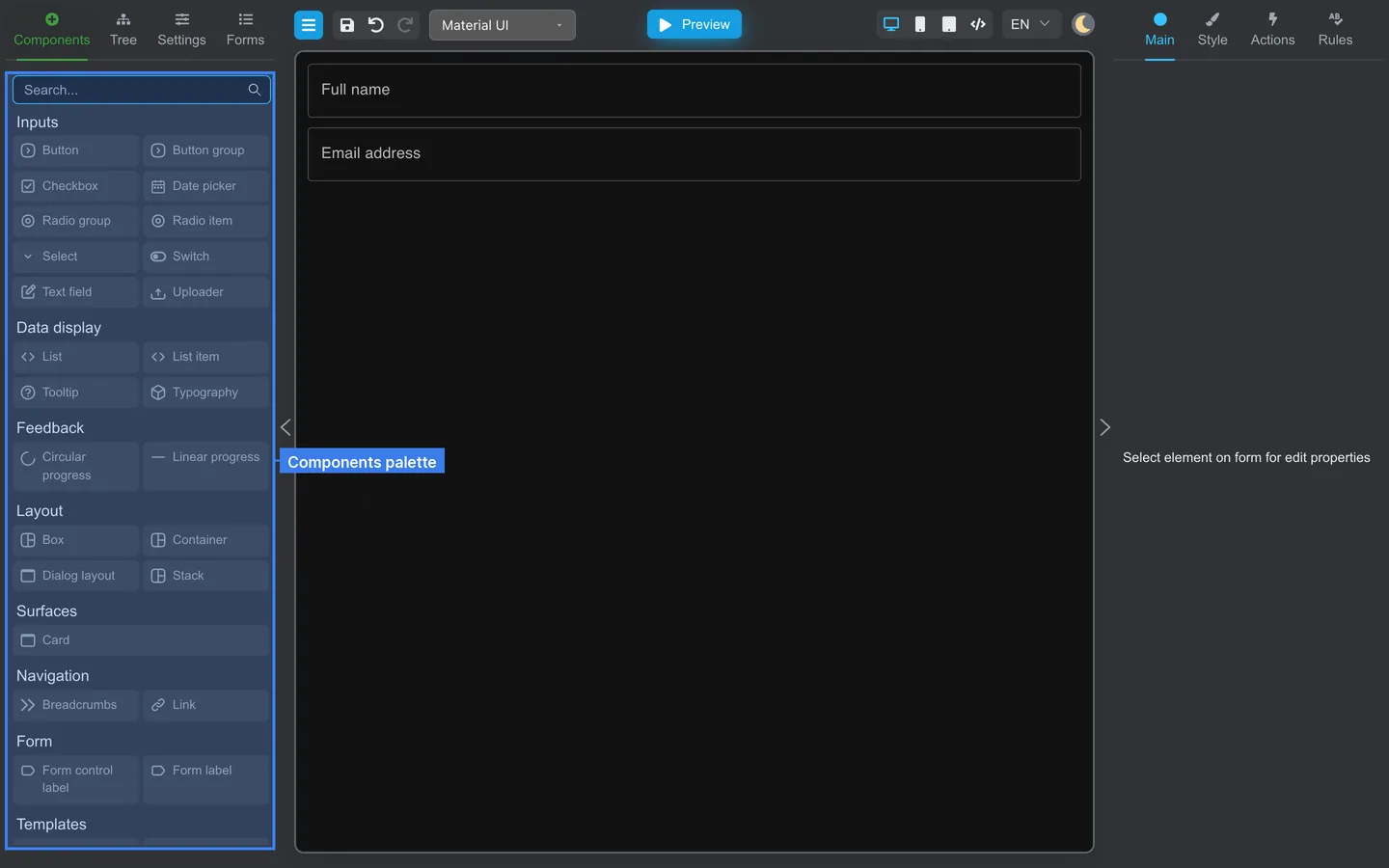
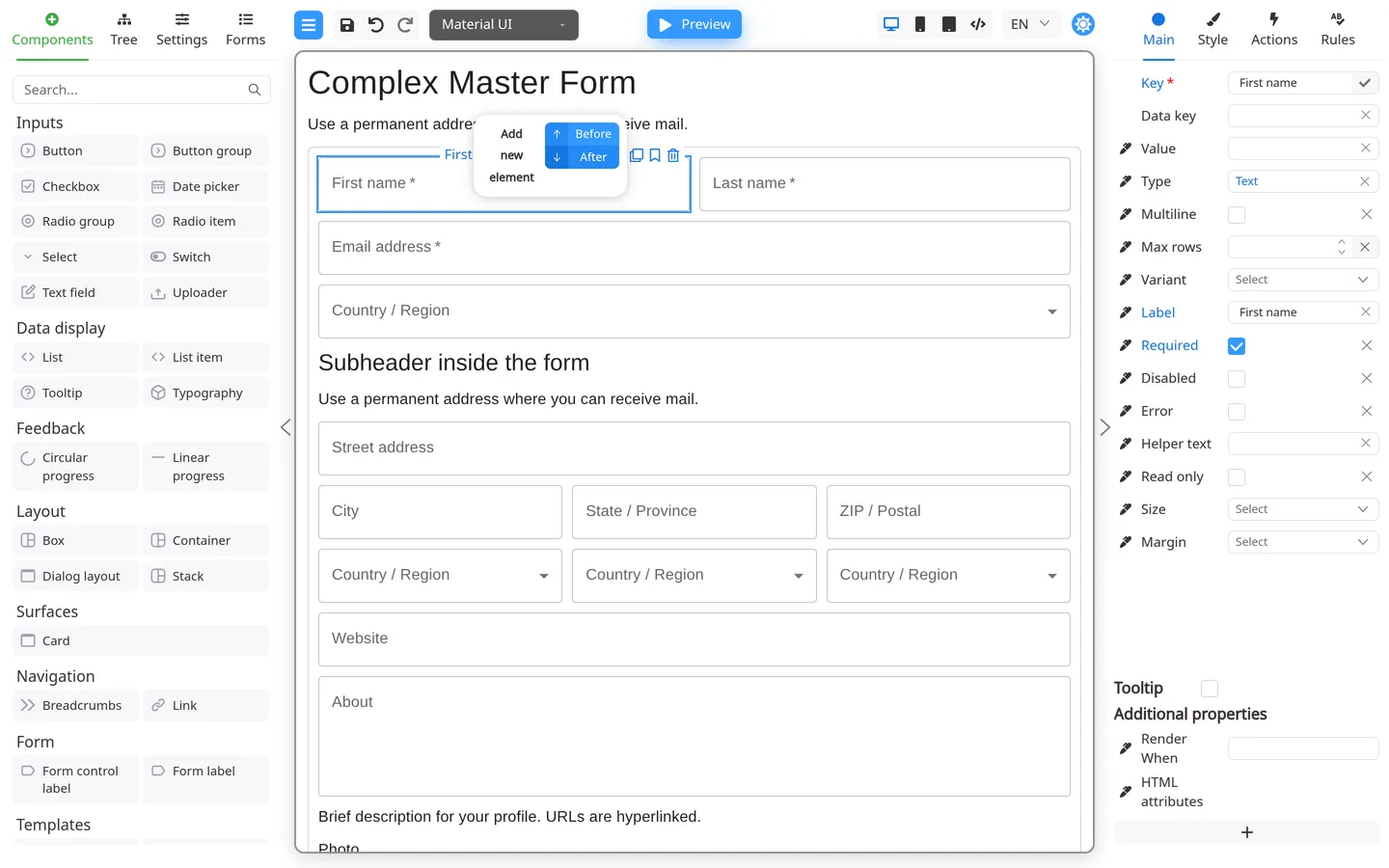
A component is one piece of the form: a text field, a button, or a container. The Components tab is the library. Drag a component onto the canvas, or double-click it. Then set Label and Key on the right.
Search the palette
- Open Components.
- Type in Search… (placeholder text matches the box).
- Categories such as Inputs and Layout filter to matching names.
- If nothing matches, the palette shows a Not found message. Clear Search… or try another term.
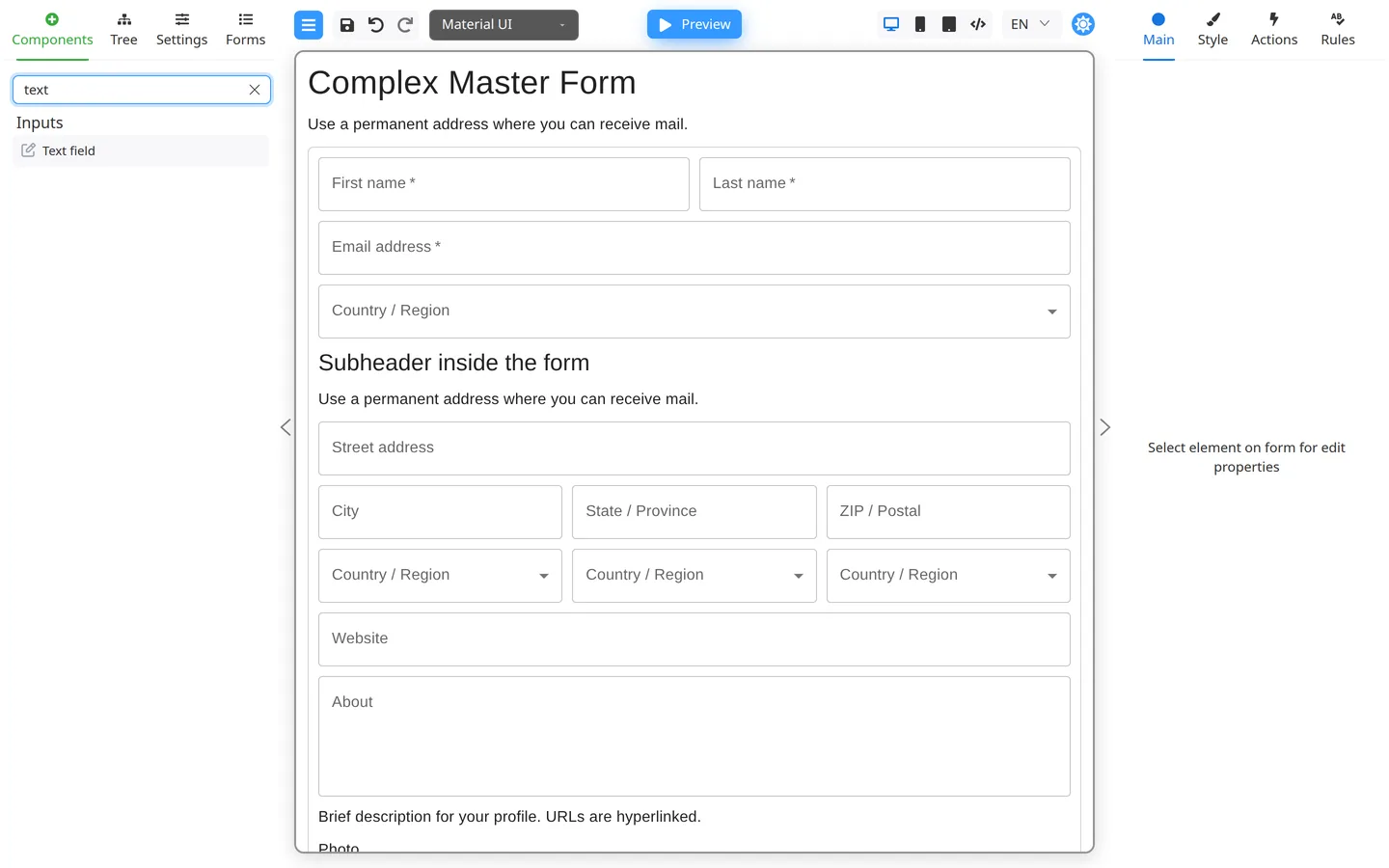
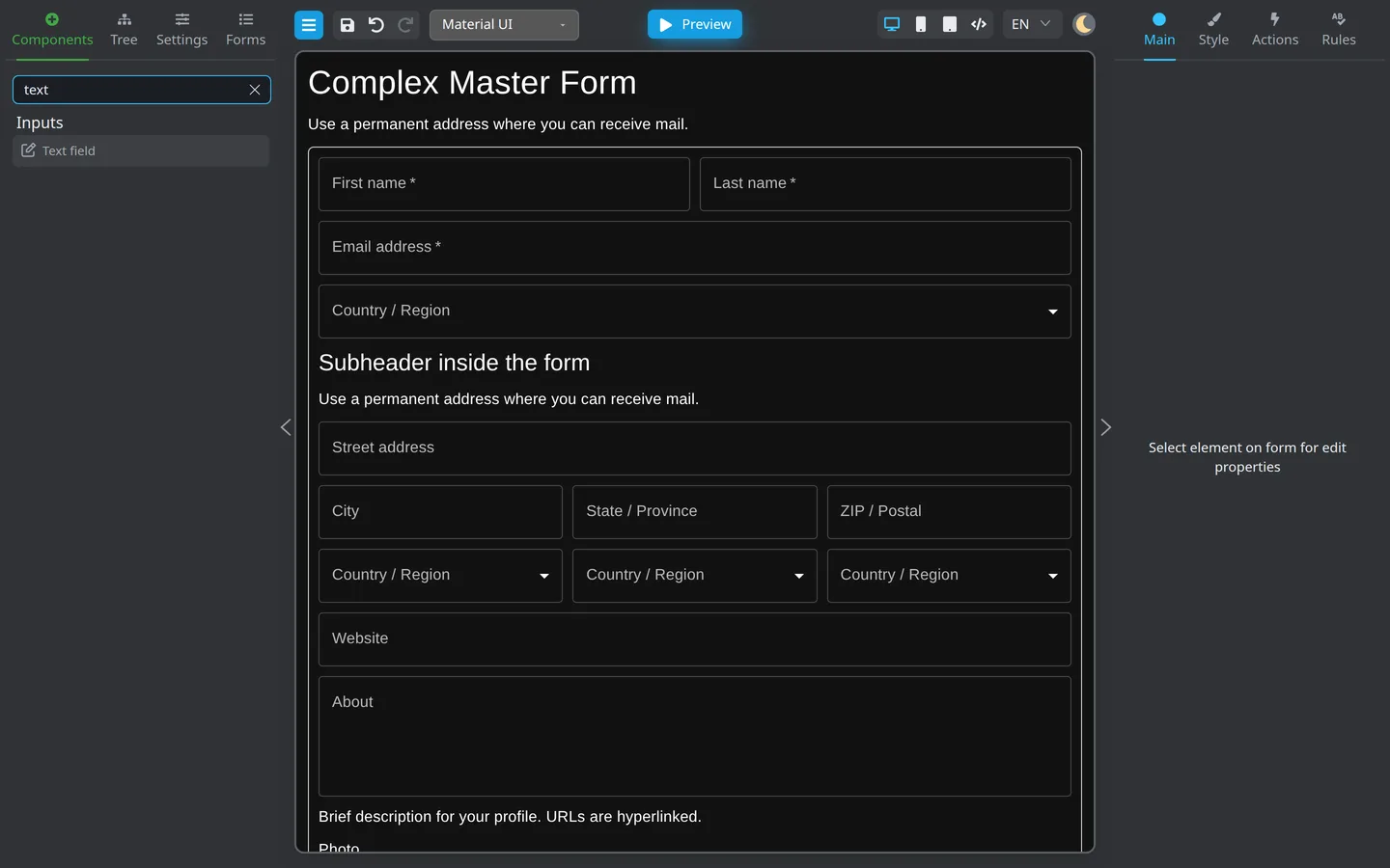
- Find a control (for example Text field).
- Drag it onto the canvas or into a highlighted drop zone on a container.
- Select the new field and set Label and Key on Main.
Double-click to insert
- Select a container on the canvas.
- Double-click a component in the palette.
- Designer inserts it inside the selection (or after the selected sibling).
Components modal
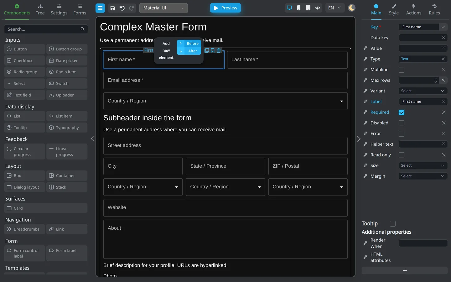
- Select a component on the canvas to show the floating toolbar.
- If you only see the key and Open actions, hover that control to expand the strip.
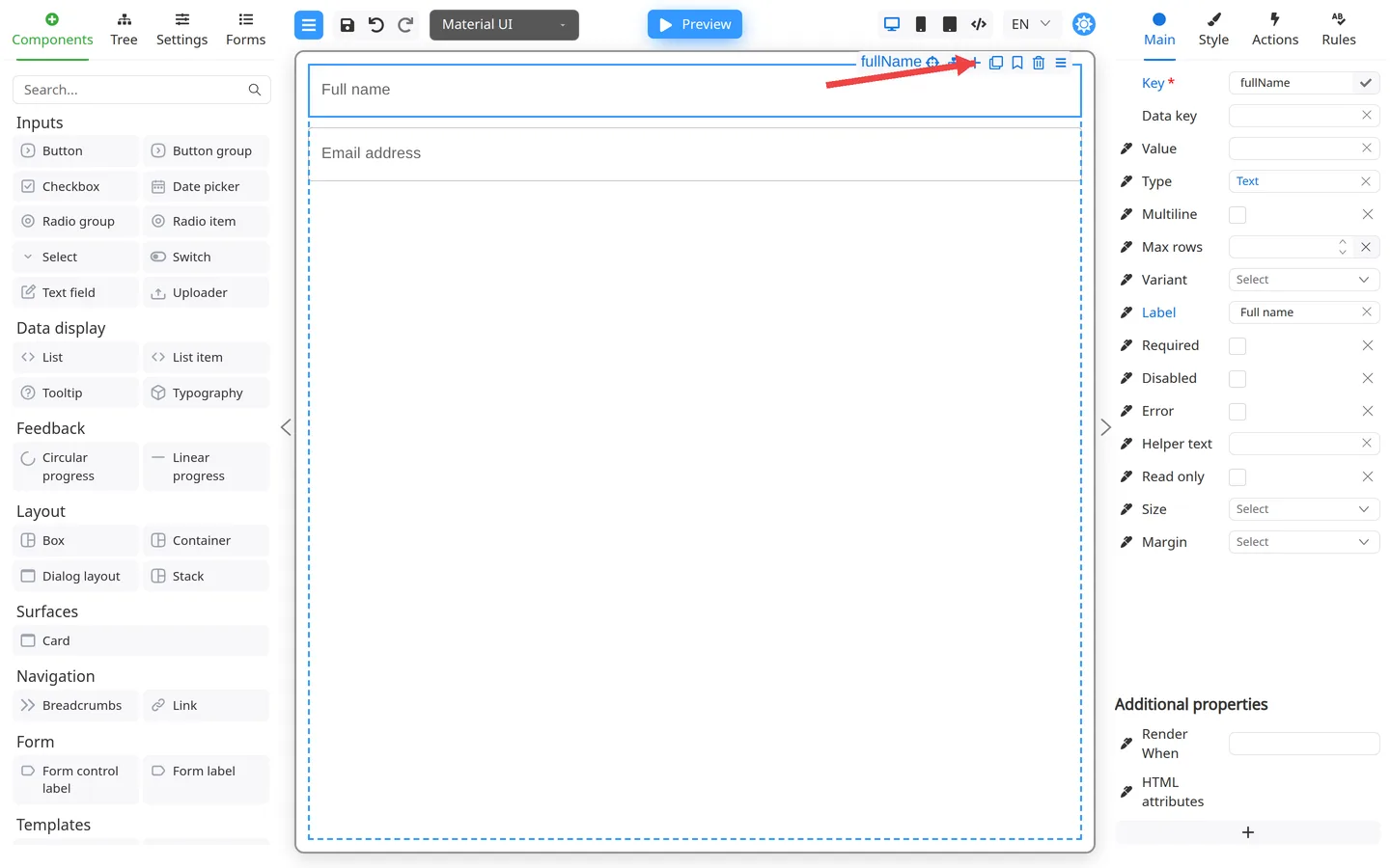
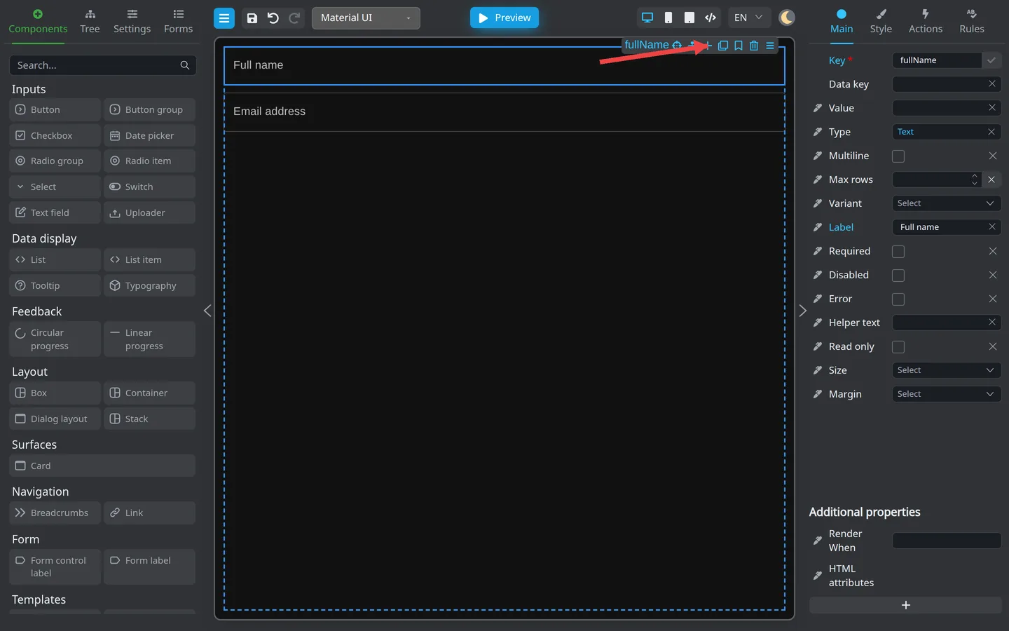
- Click plus button.
- Choose Before or After.
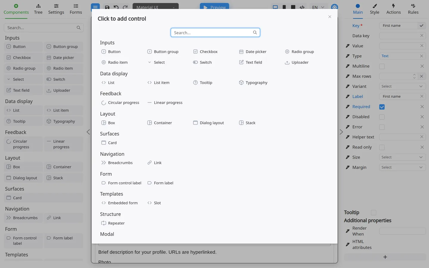
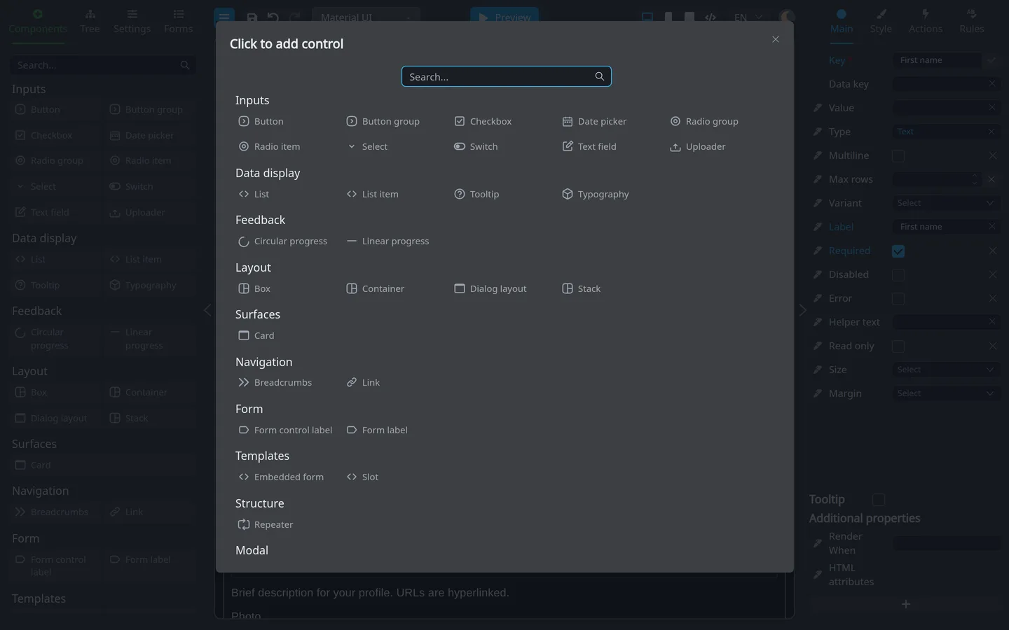
- The Click to add control modal opens. Search and categories match the left palette.
- Click a component to insert it.
Use this modal when the left palette feels crowded, or when you want to place a control next to the current selection.
Summary
Search… narrows the palette. Drag or double-click to place components, then configure them on Main. Use Tree to verify where new items landed.