


Modals for form authors
A modal is a dialog that sits on top of the current form. Typical uses include confirming a deletion, asking one extra question, or showing a short notice without leaving the page.
This workflow uses two forms: one for the dialog content and one that opens it. You connect them with a Modal component, openModal on a button, and closeModal on OK or Cancel.
For developers working in JSON, see Modal windows and Modal components.
When to use a modal
- Confirm something destructive (“Delete this record?”)
- Collect one short extra step
- Show help or legal text briefly
If the task needs many fields or a long workflow, use a normal form or wizard instead.
The moving parts
| Piece | What it does |
|---|---|
Modal form (for example confirm-dialog) | Layout and fields inside the dialog |
| Modal component on the main form | Placeholder that loads that form |
| Settings → Modal | Dialog UI type (for example Mui Dialog) |
| openModal on a button | Opens the dialog; modalKey must match the Modal key |
| closeModal on OK / Cancel | Closes the dialog; result can tell the main form what happened |
Step 1: Create the modal form
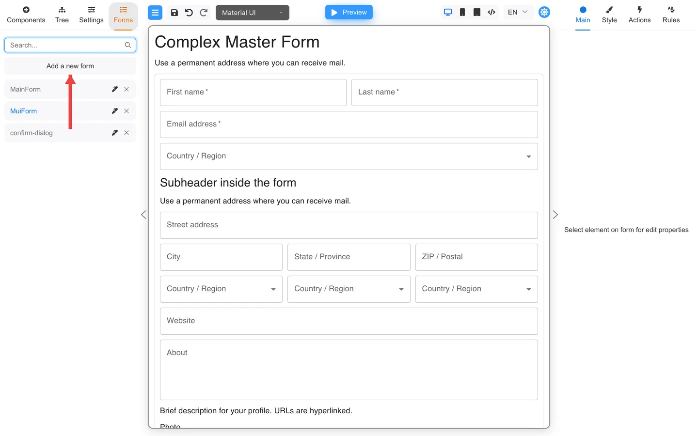
- Open the Forms tab.
- Click Add a new form.
- Give it a clear name such as confirm-dialog.
- Save it so it shows up in the list.
You will pick this name again as the Modal template.
Step 2: Build the dialog content
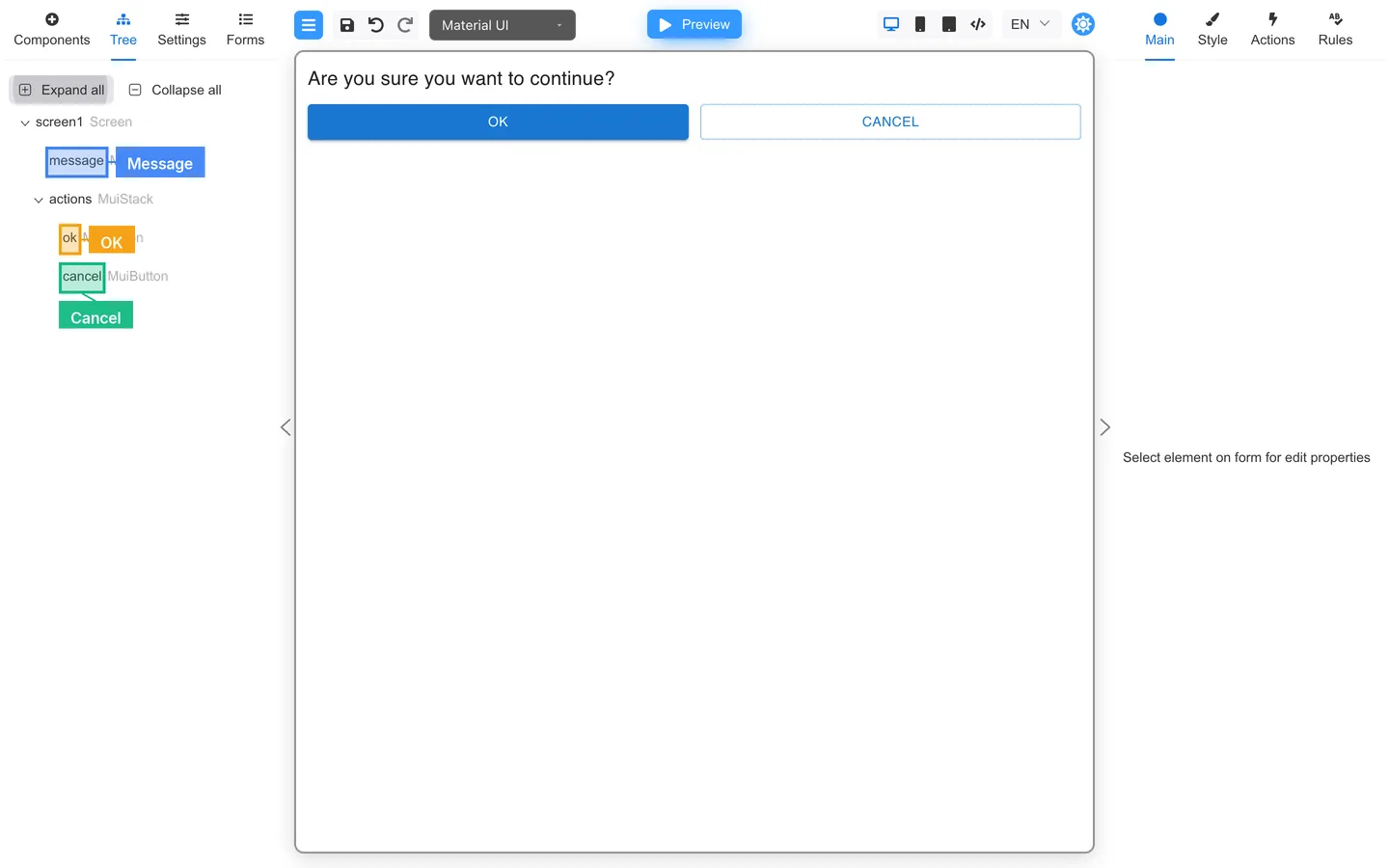
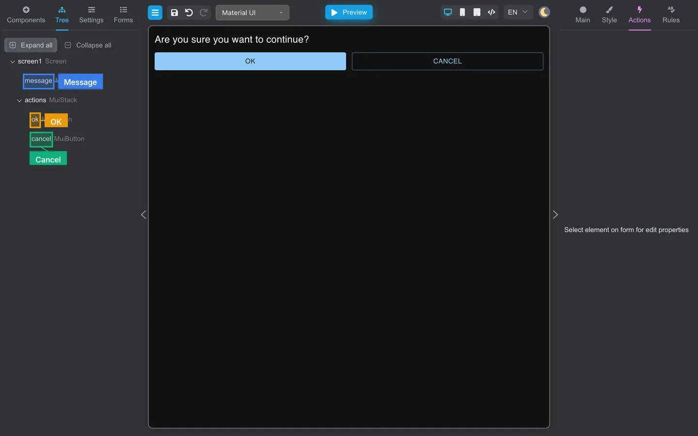
- Open confirm-dialog from the Forms list (pencil icon).
- Add a short message (a Typography component works well).
- Add OK and Cancel buttons.
Keep it small. One question, two answers.
Step 3: Close the dialog from the buttons
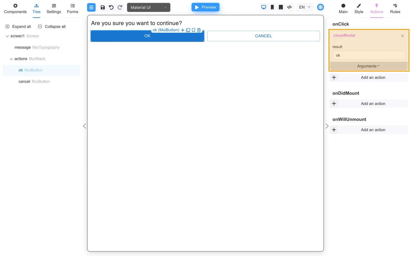
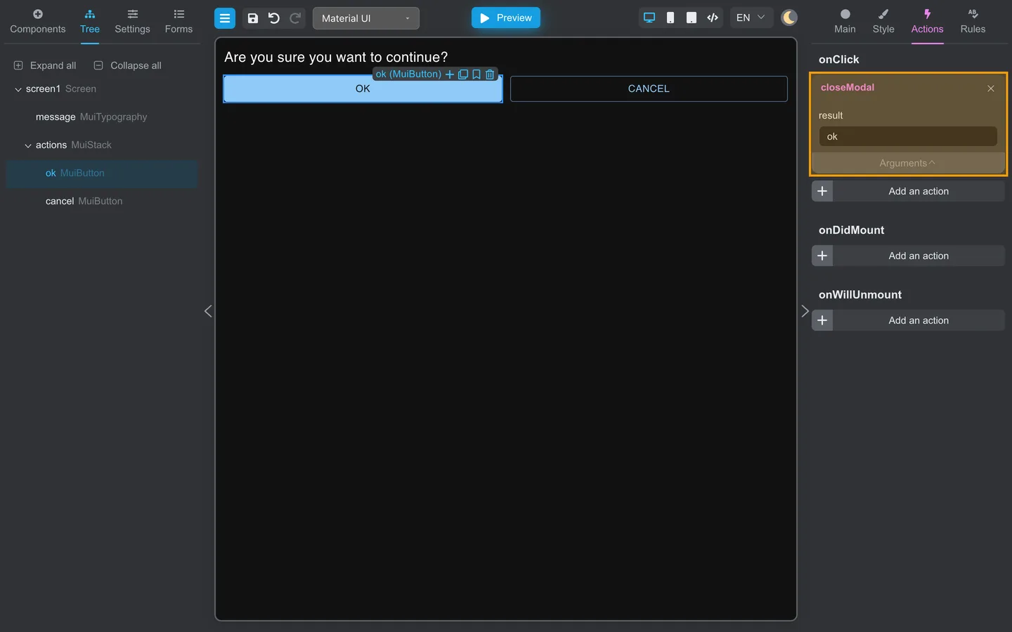
- Select OK.
- Open Actions.
- Under onClick, add closeModal from Common.
- Open Arguments and set result to
ok(or another short value your team agrees on). - Do the same for Cancel, with result
cancel.
closeModal closes the dialog. The result string is only needed if the main form later checks what the user chose (advanced beforeHide setups).
Step 4: Set the dialog type on the main form
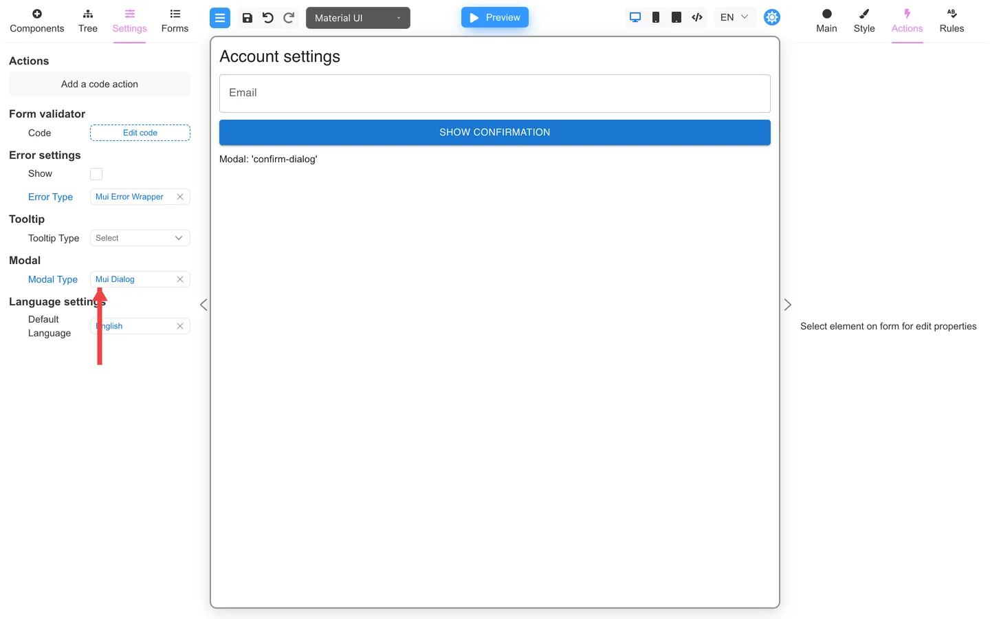
- Create or open the form that should open the dialog (for example MainForm).
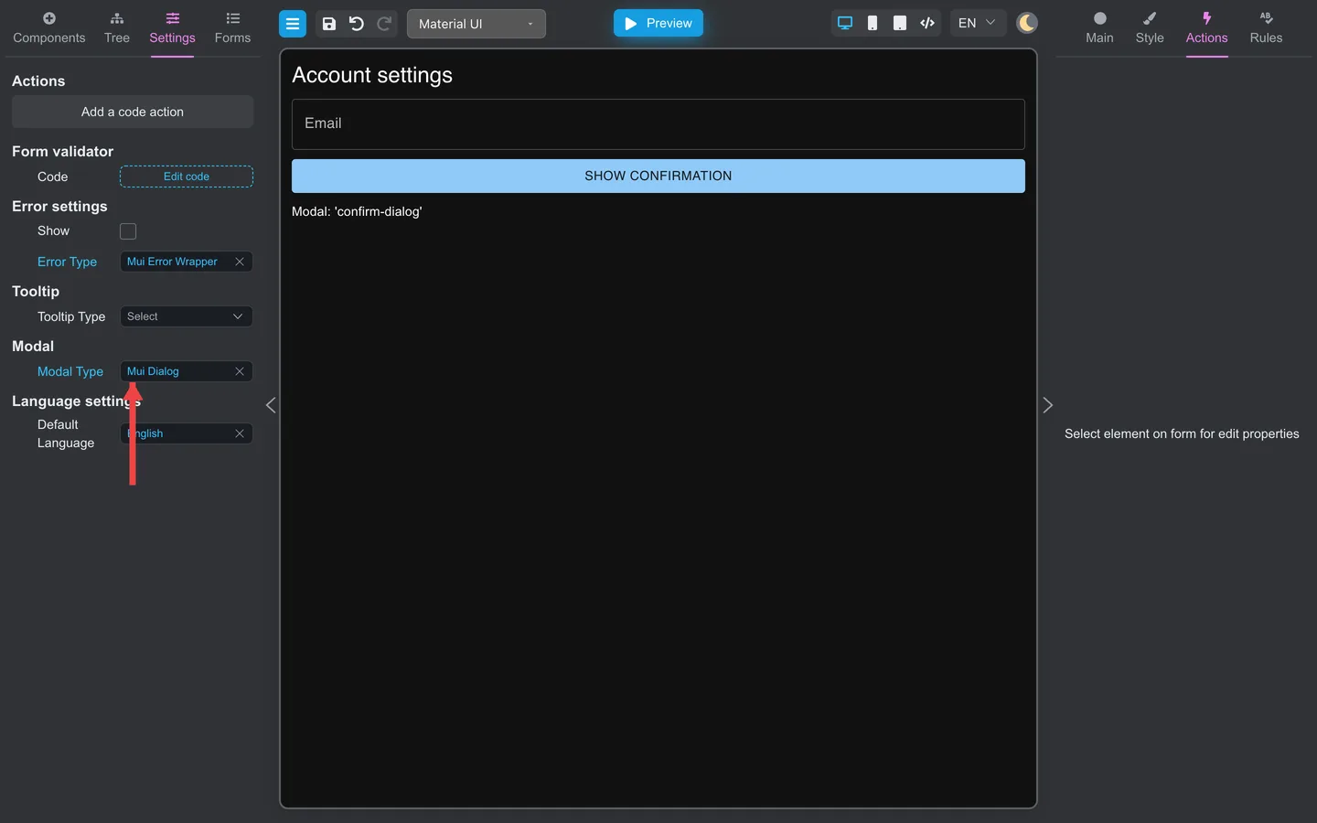
- Open Settings on the left.
- Under Modal, pick the type for your UI kit. With Material UI this is often Mui Dialog.
Dragging a Modal component onto the form can set this for you. Still check that it matches your library.
Step 5: Add a Modal component
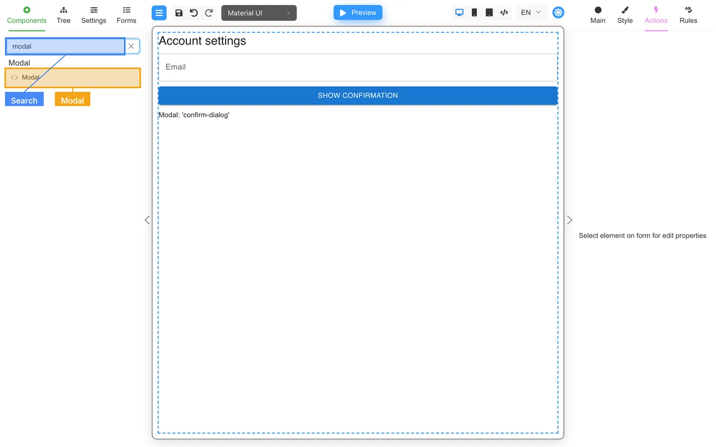
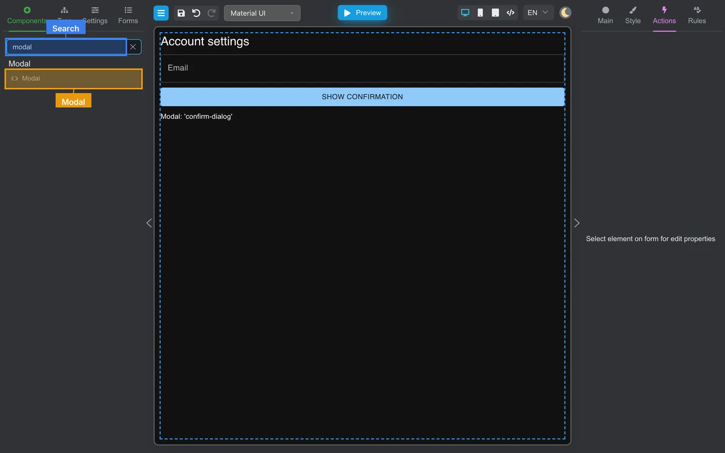
- Stay on the main form and open Components.
- Search for modal.
- Drag Modal onto the canvas or into the tree.
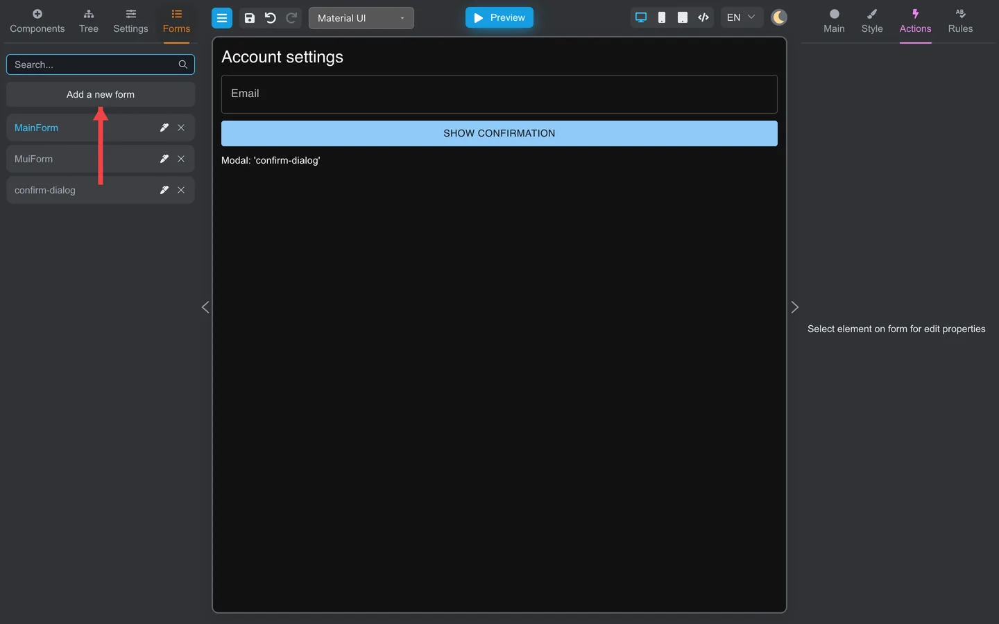
Until you set a template, the canvas shows a placeholder like Modal: '…'.
Step 6: Link the Modal to confirm-dialog
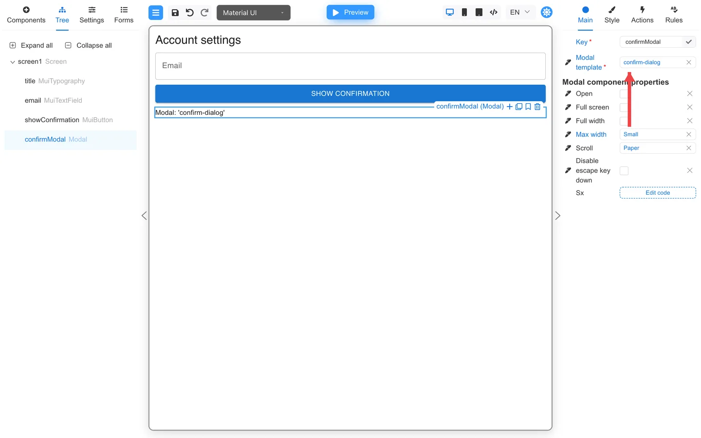
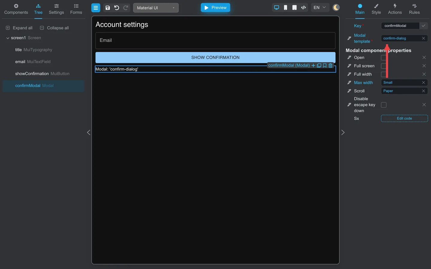
- Select the Modal component.
- On Main, set Key to something stable, for example
confirmModal. - Set Modal template to confirm-dialog.
That property is what loads your dialog form into the placeholder.
Step 7: Open it from a button
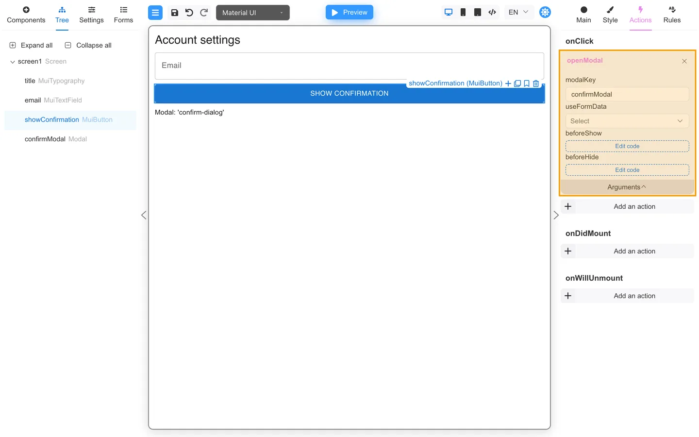
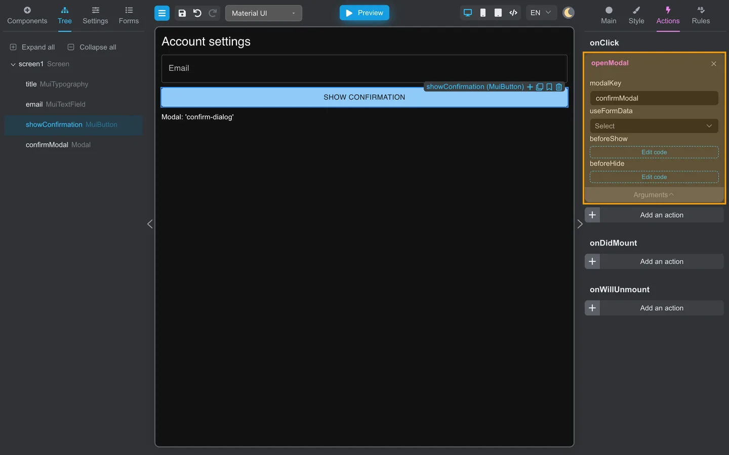
- Add a Button, for example Show confirmation.
- Open Actions → onClick.
- Add openModal from Common.
- Open Arguments.
- Set modalKey to the Modal key (
confirmModal).
If the dialog should see the current form values, set useFormData as well.
Step 8: Try it in Preview
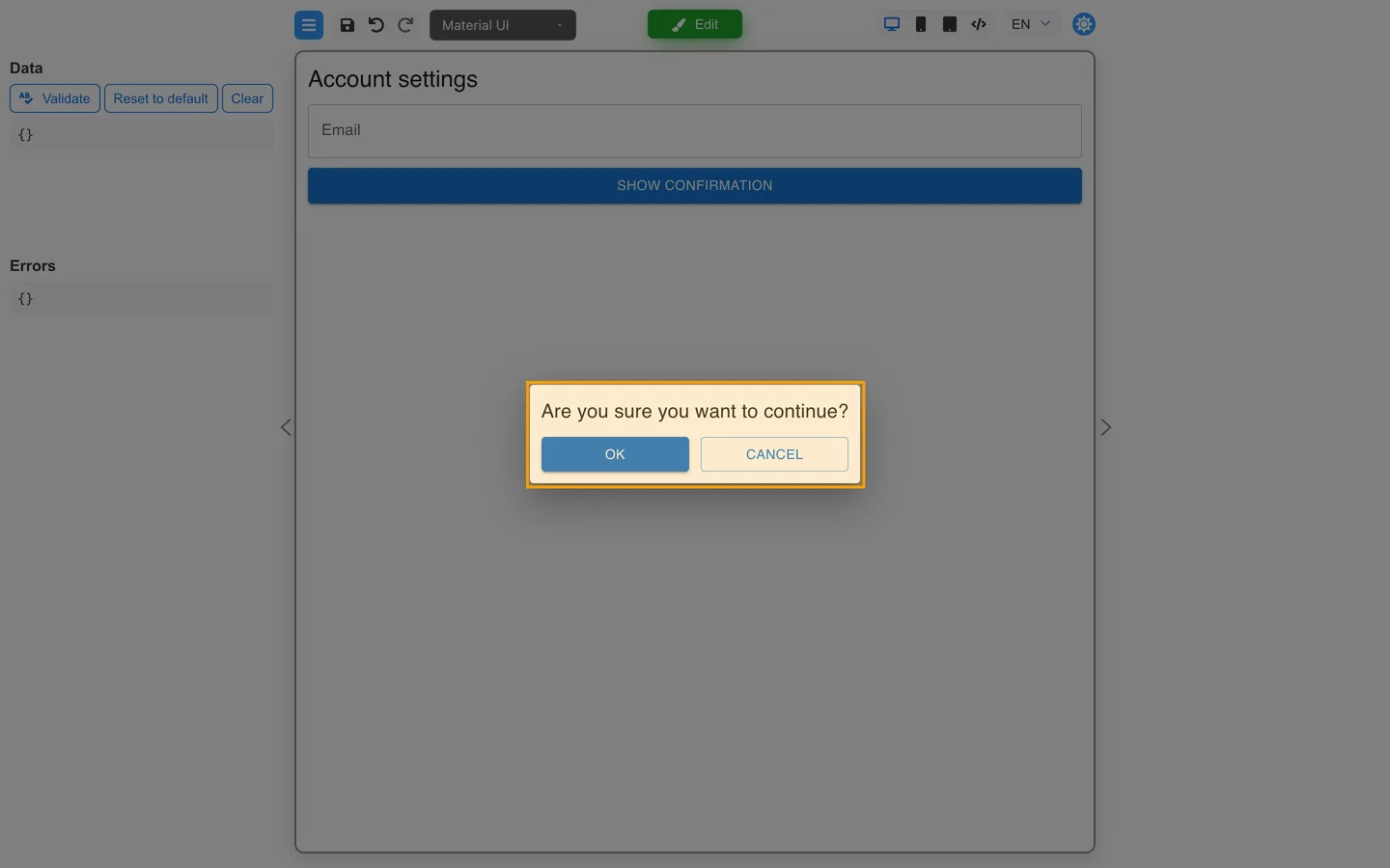
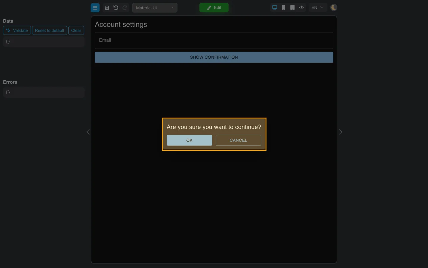
- Click Preview.
- Click Show confirmation.
- Check that the dialog shows your modal form.
- Click OK or Cancel and make sure it closes.
Save both forms under Forms so Preview can load confirm-dialog by name when the dialog opens.
Summary
Create a small modal form with closeModal on its buttons. On the main form, set Settings → Modal, add a Modal component, and set Modal template. Then call openModal from a button with a matching modalKey and check the flow in Preview.