


Rows, columns, and grids
Use grid or horizontal stack layout components for side-by-side fields such as city and state or first and last name.
Vertical vs horizontal
| Layout | Best for |
|---|---|
| Stack (vertical) | One field per row |
| Grid / row layout | Two or more fields on one row |
Example: shipping address form
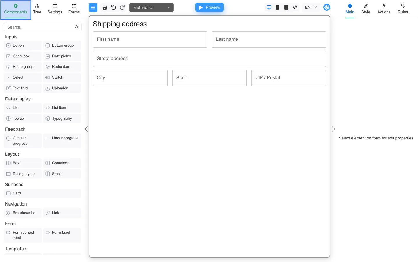
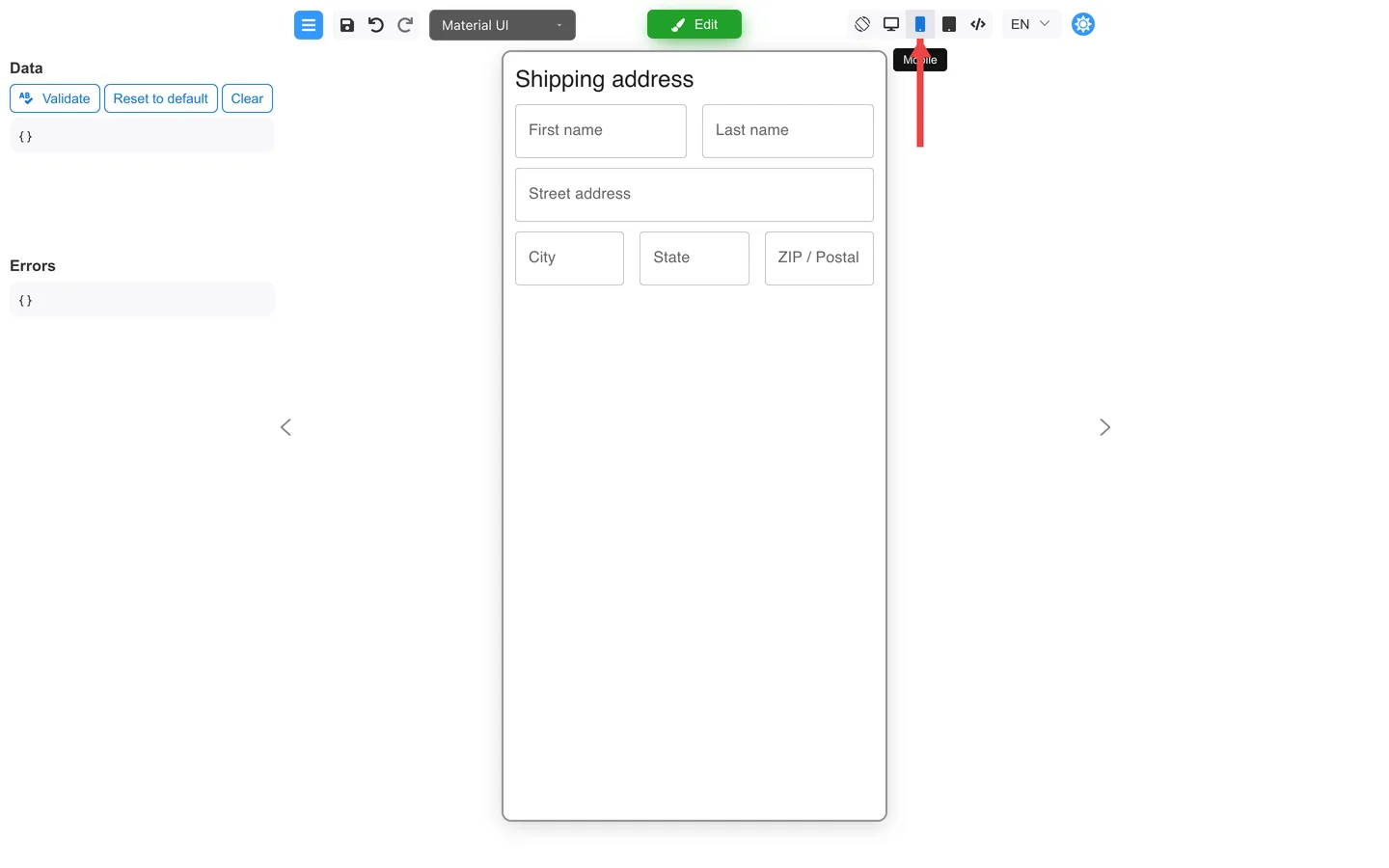
This walkthrough uses a Shipping address form with horizontal Stack rows for name and city fields.
Step 1: Add a horizontal Stack
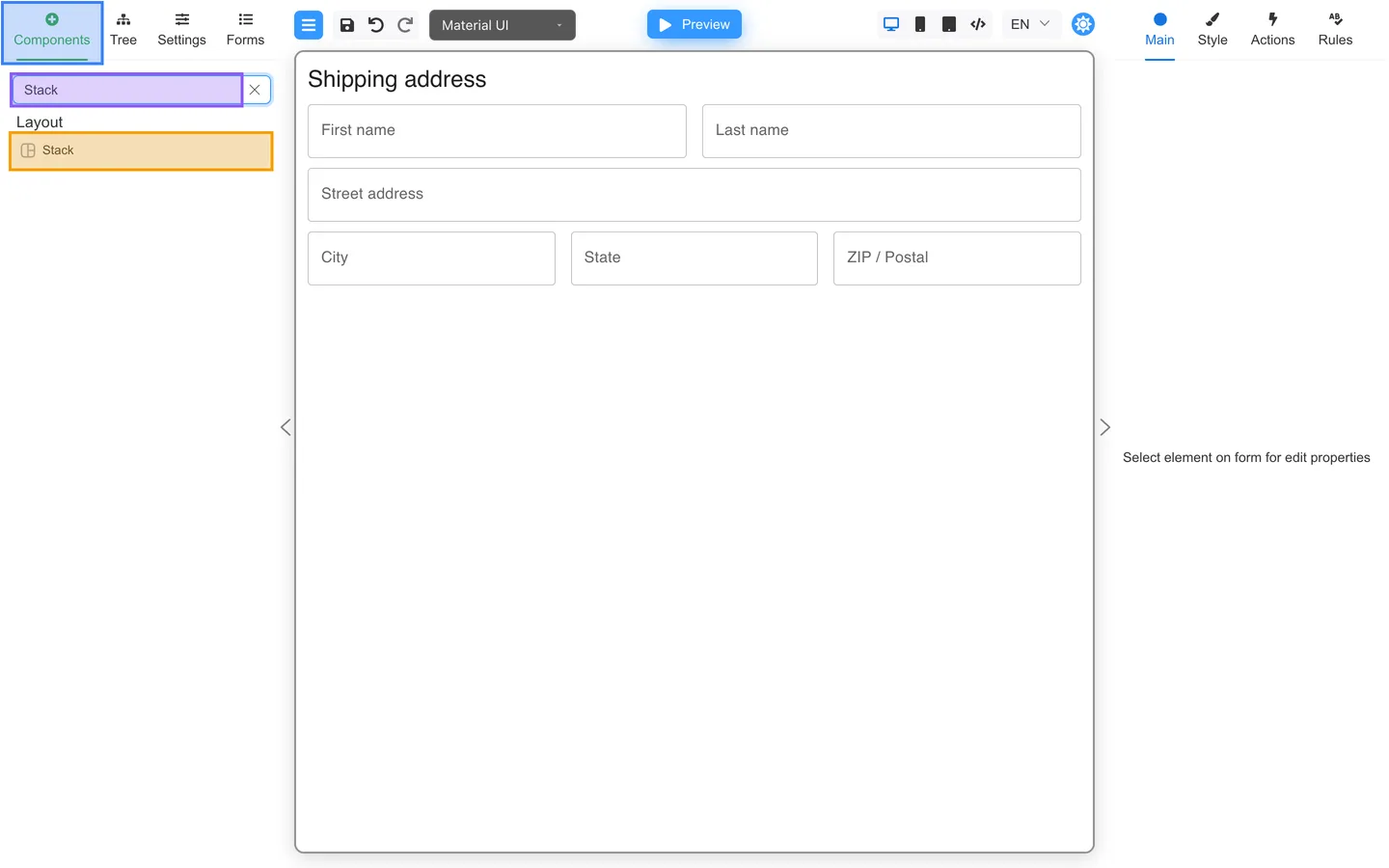
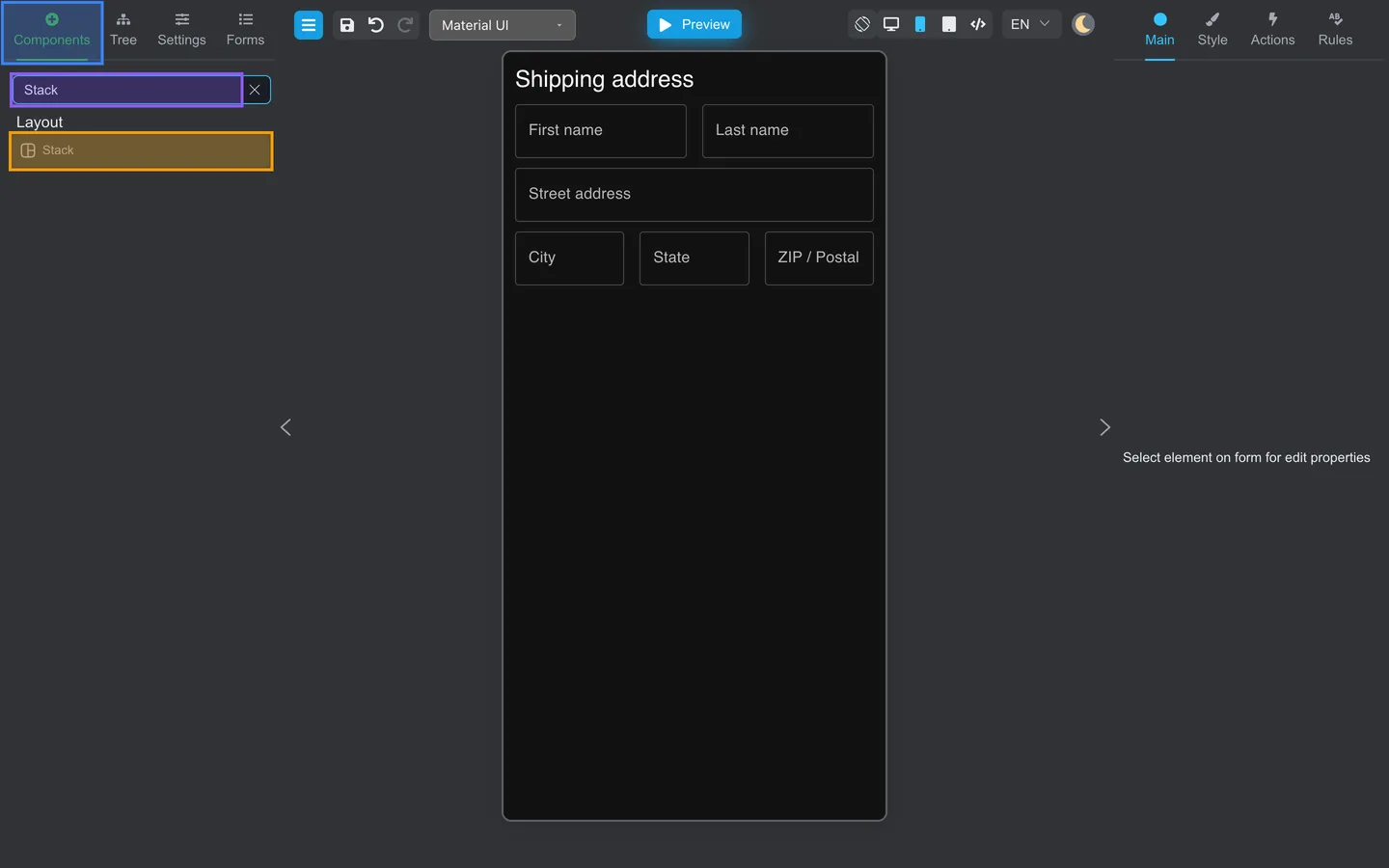
- Open Components.
- Search for Stack.
- Drag Stack onto the canvas.
Step 2: Set direction to row
- Select the row Stack in Tree (for example
nameRow). - On Main, set Direction to row.
- Set Spacing (for example
16px).
Step 3: Add fields to the row
- Drag First name and Last name Text field components into the row Stack.
- Add a full-width Street address field below the row.
- Add a second horizontal Stack with City, State, and ZIP / Postal.
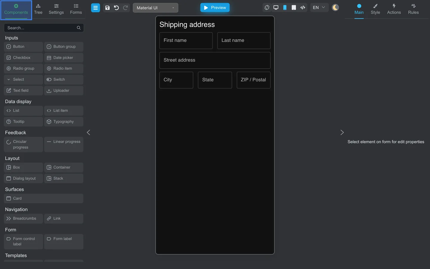
Step 4: Check the canvas
Step 5: Verify in Tree
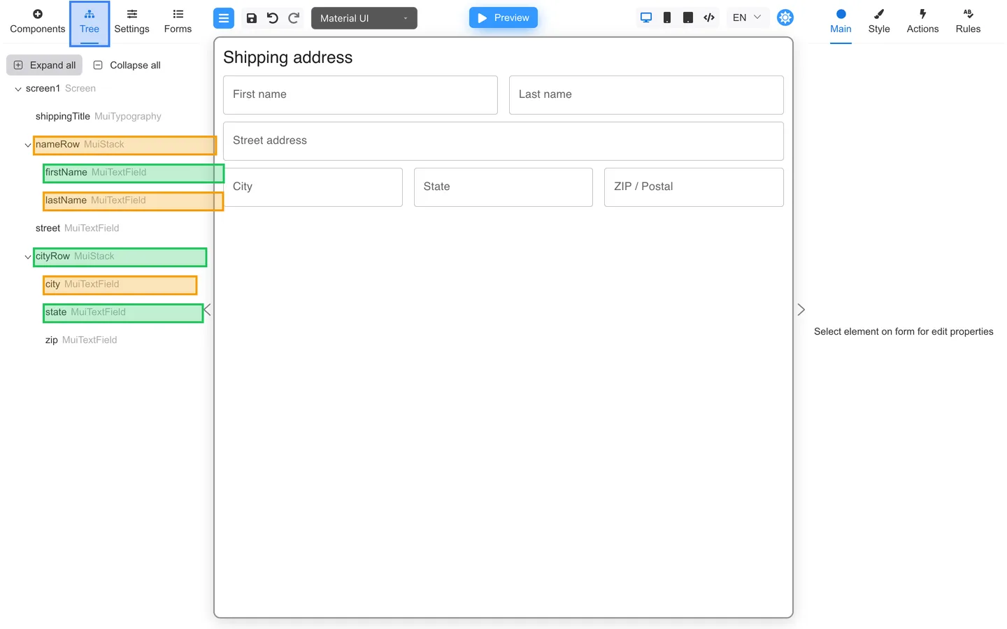
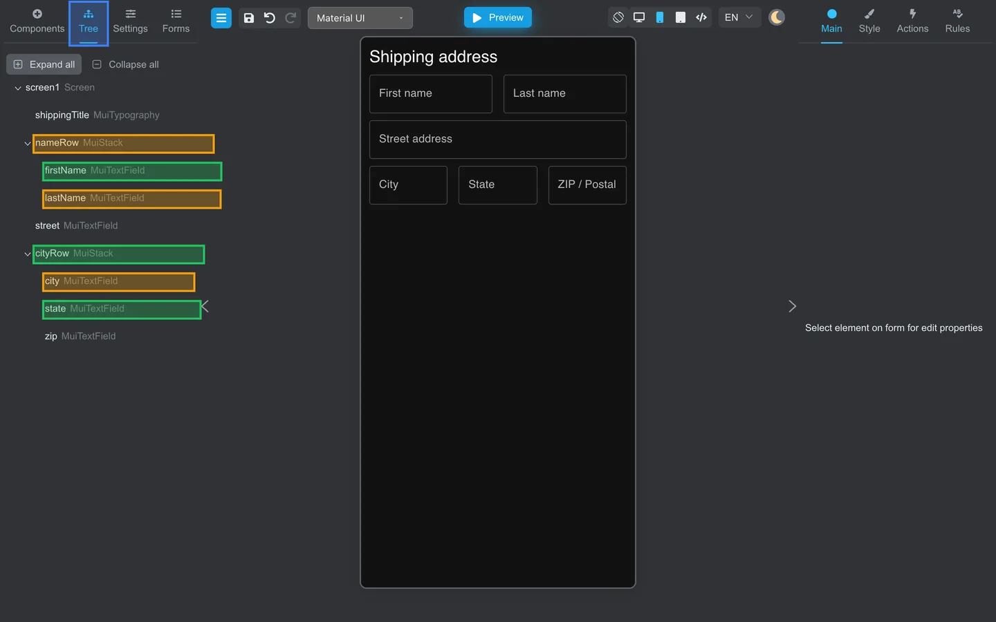
- Open Tree → Expand all.
nameRowandcityRowshould each list their child fields indented underneath.
Test responsive layout
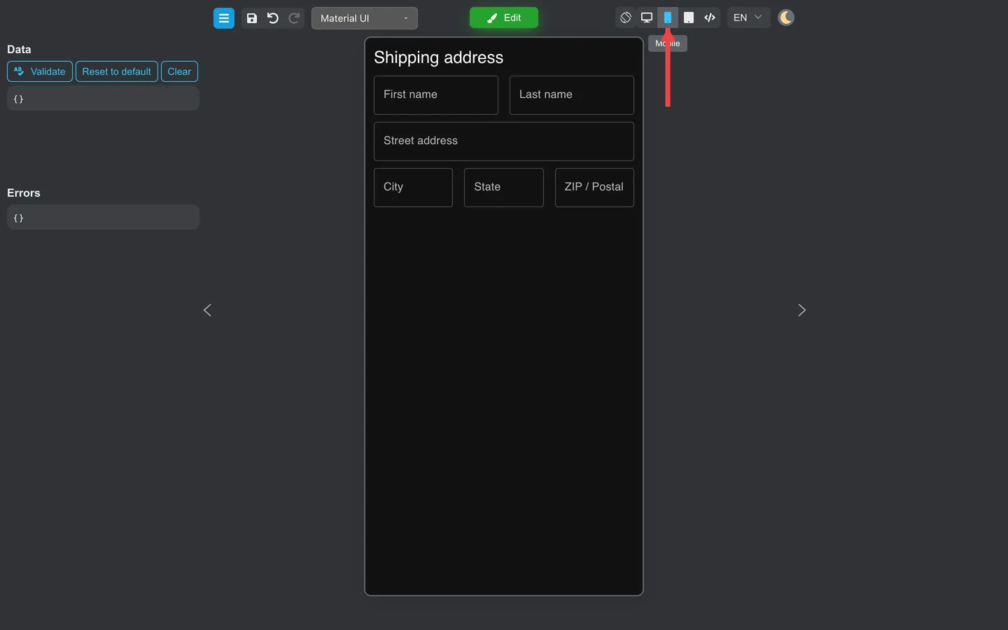
Compare Desktop and Mobile preview so side-by-side fields still read well on narrow screens.
- Click Preview.
- Click Desktop or Mobile in the header toolbar (next to Preview / Edit).
- Confirm fields stack or wrap readably on Mobile.
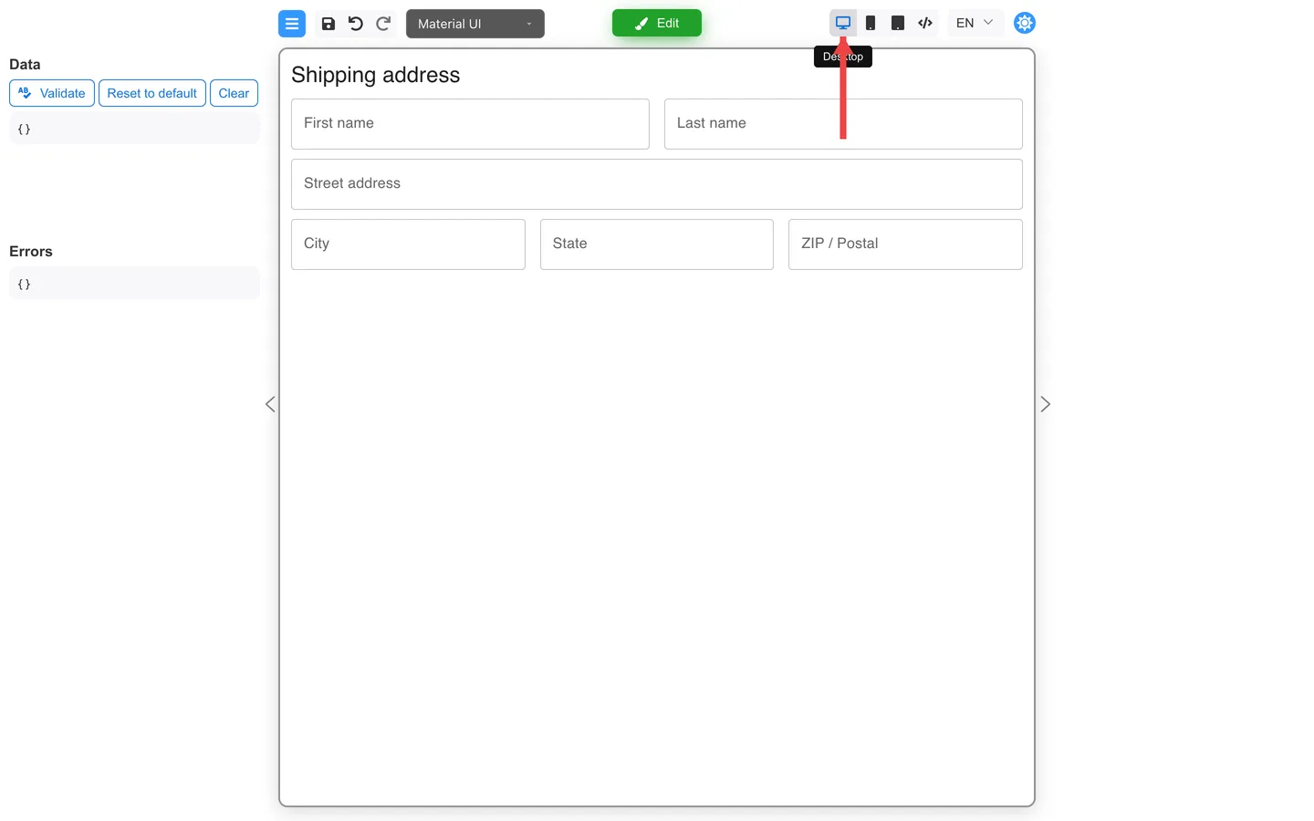
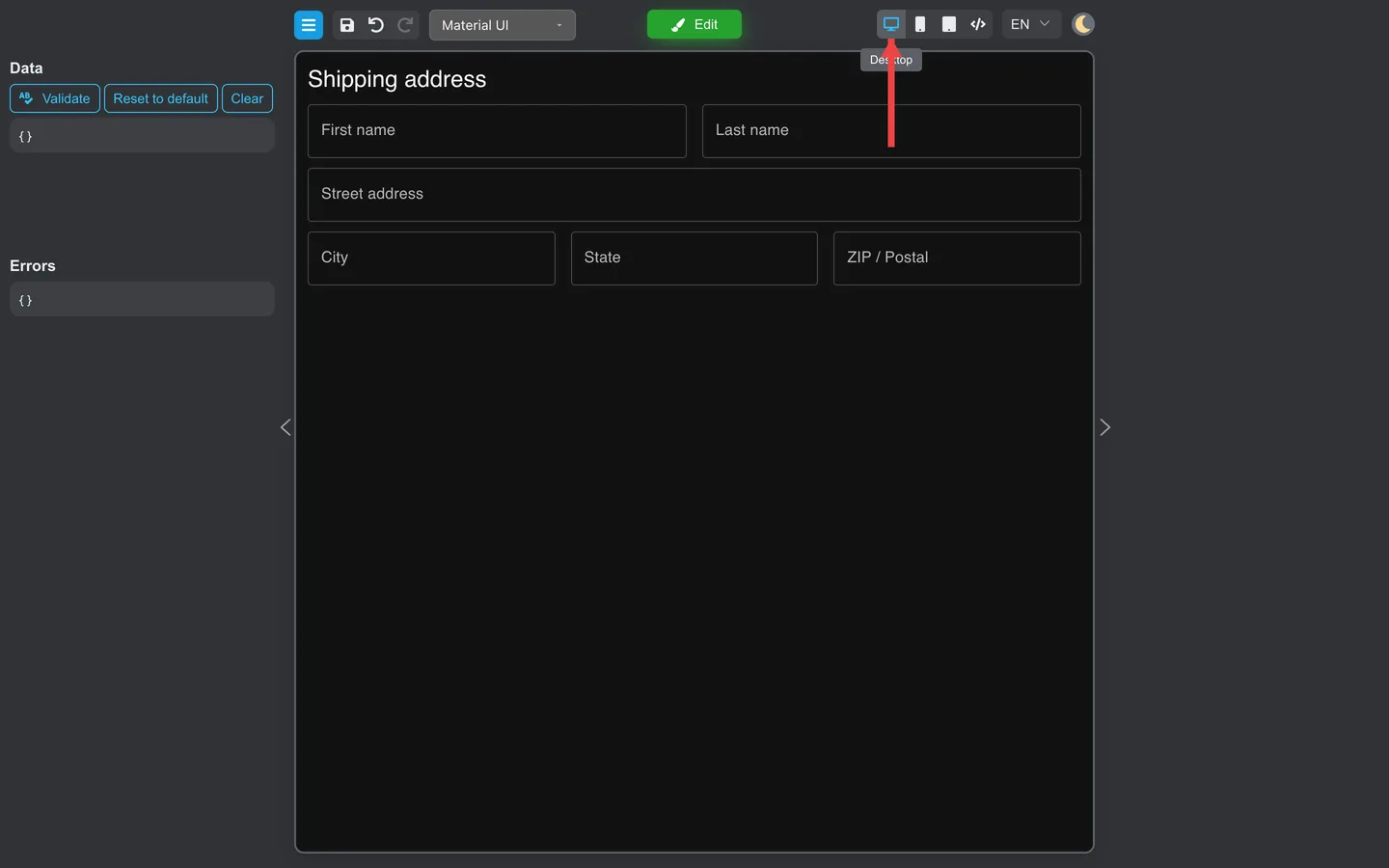
Developers: Responsive breakpoints and advanced layout rules are documented in Adaptive layout.
Summary
Use grid or stack components for multi-column rows. Preview the form in Mobile mode after layout changes.