


The Designer workspace
The Designer screen has four parts: a top bar, a left panel, a canvas in the center, and a properties panel on the right.
The four regions
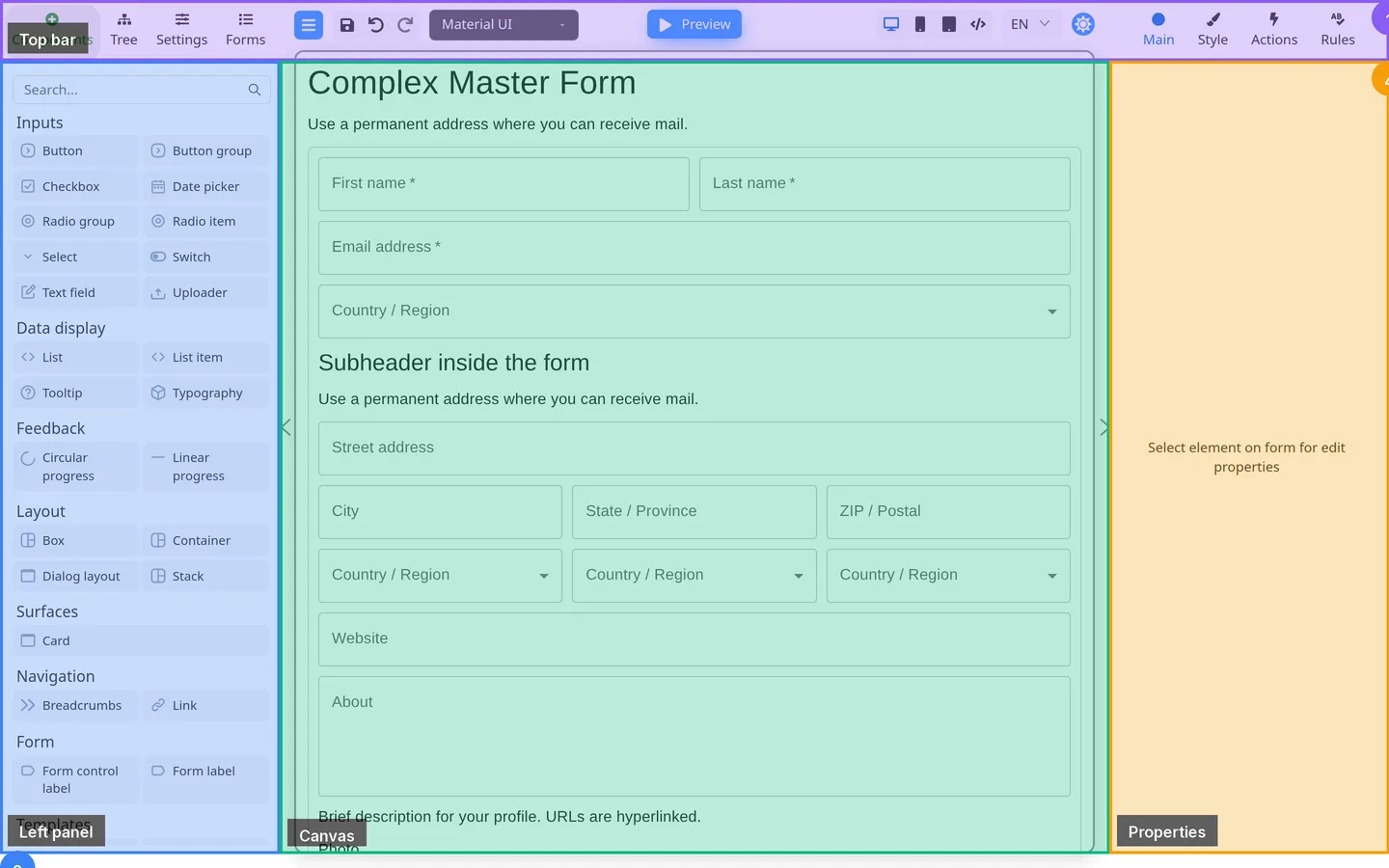
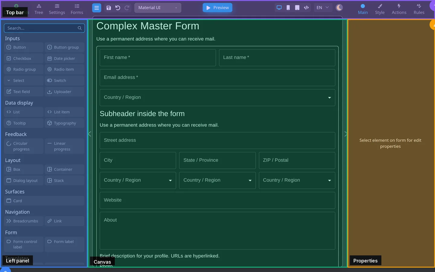
- Top bar - menu, undo/redo, Component library picker (available in the public demo), Preview, device sizes, language.
- Left panel - Components (the library), Tree, Settings, Forms.
- Canvas - the form layout you are building.
- Properties - Main, Style, Actions, Rules for the selected component.
Name the regions on a real form
- Open the Event registration demo above.
- Find the four regions: top bar, left panel, canvas, properties.
- Click Preview, fill a field, then click Edit to return.
You edit on the canvas. You test in Preview.
Screen, form, and page
| Term | In Designer |
|---|---|
| Screen | The Tree root (usually keyed screen1). Everything you add sits inside it. |
| Form | The named design you save, download, or export. |
| Page | Where your application shows the form to users. Authors do not build that page here. |
The Forms tab lists saved designs when storage is enabled. See Left panel tabs.
How you move between regions
- Add from the left. Arrange on the canvas. Change settings on the right.
- Click Preview in the top bar to try the form.
- Whole-form options are on the left Settings tab, not the right panel.
Next
| Next page | What you do |
|---|---|
| Add components | Search the palette, drag or double-click |
| Select and edit | Select on canvas or Tree and edit on the right |
| Preview and Edit | Test like a user, then return to layout |
| Save and share | Save, download, export; publish is the host app |
After that, create your first form. More samples: Examples and use cases.
Summary
Find the four regions on Event registration. Then add a component and open Preview.