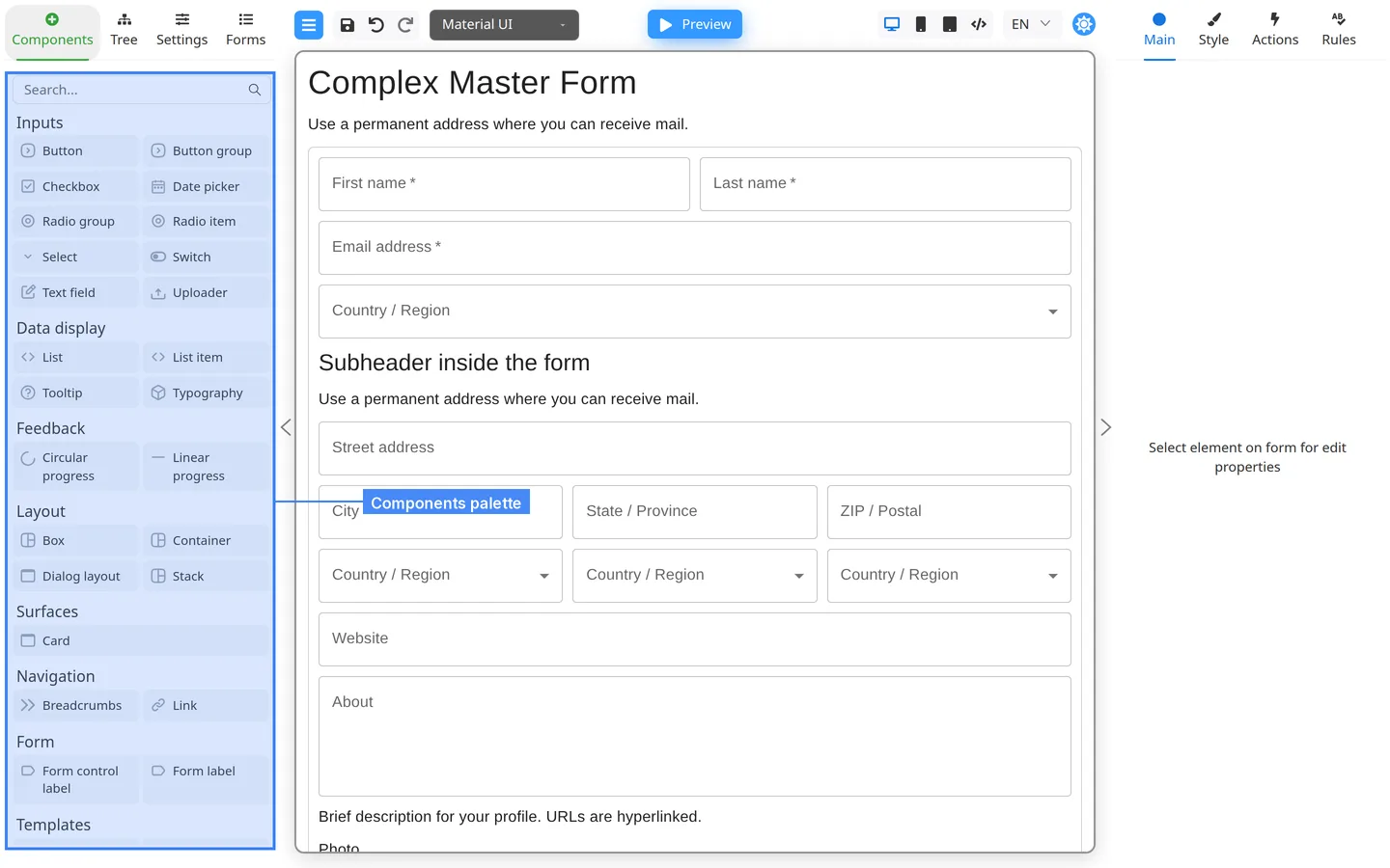
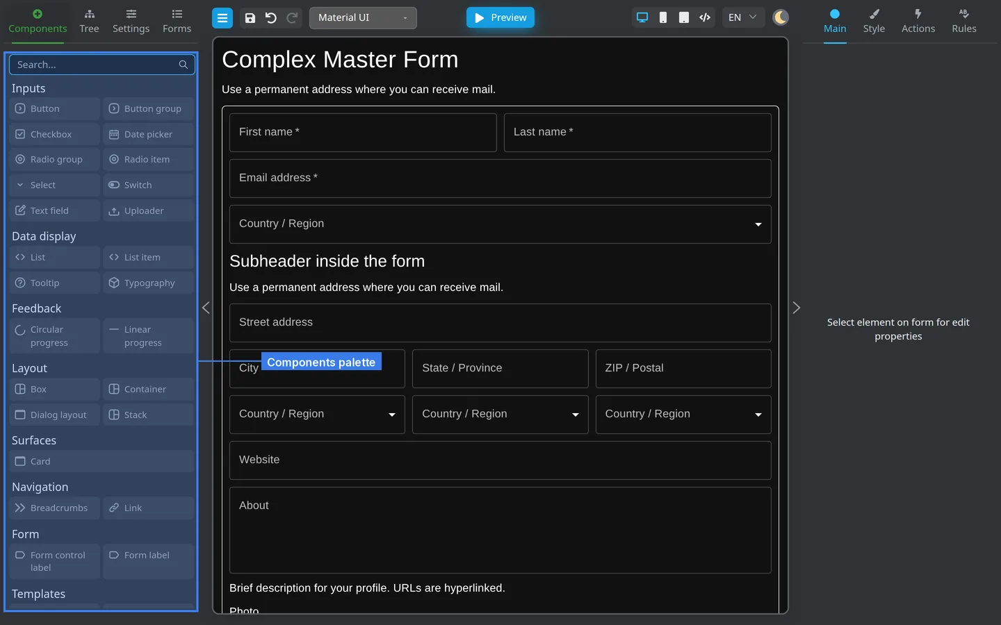
The Components tab lists building blocks you drag onto the canvas. Names vary slightly by Component library (Material UI, RSuite,
and others).
Text and numbers
Need
Typical component
Single-line text
Text field / Input
Multi-line text
Text area
Numbers
Number input
Choices
Need
Typical component
Pick one from a list
Select / Dropdown
Yes or no
Checkbox or Switch
Pick one of few options
Radio group
Actions and display
Need
Typical component
Submit or save
Button
Section title
Typography / Heading
Group fields
Stack, Grid, or Container
Add a component
Open Components on the left panel.
Use Search if your palette is large.
Drag the component onto the canvas or into a container in Tree.
Check the result
The new field appears on the canvas and under Tree.
Selecting it opens Main, Style, Actions, and Rules on the right.
Summary
Match the component to the kind of data you collect. Search the palette when you cannot find a control. Configure keys and labels on
Main after placing the field.